These 10 Car Brand Logos Need To Make A Comeback
These 10 companies should turn back the clock to a time before brands started draining the personalities from their logos to fit the digital age.
It feels like every other month that some automaker is announcing a flashy rebrand — one that takes a distinctive logo with depth and weight and flattens all the life out of it, so it might be slightly easier to read on a smartphone screen. Call it a necessity of marketing in these modern times if you wish, but we're just not having it. Some brands have transitioned to the so-called digital era less admirably than others, and so today we thought we'd highlight 10 older logos that these companies ought to return to. Not that they ever would, of course. To regress is to admit failure, and that's just not the corporate way. Let's get to it.
Kia
We'll start with an obvious one. Was the old Kia logo pretty? No. But it was legible, and didn't result in tens of thousands of people searching "KN car" on Google to learn the make behind the EV6 the first time they see one on the road. I'm sure an analyst would say that provoking people to search "KN" only for Google to automatically redirect them to "Kia" is a shrewd, innovative marketing practice, but it also kind of gives me a migraine whenever I tail a Telluride. Kia's previous badge was decidedly dated, sure; the company's design and prestige has risen far too high to be dragged down by the same sad oval on the grille of every unloved Sephia. But given a choice between the two, I'll take the one I can read.
Peugeot
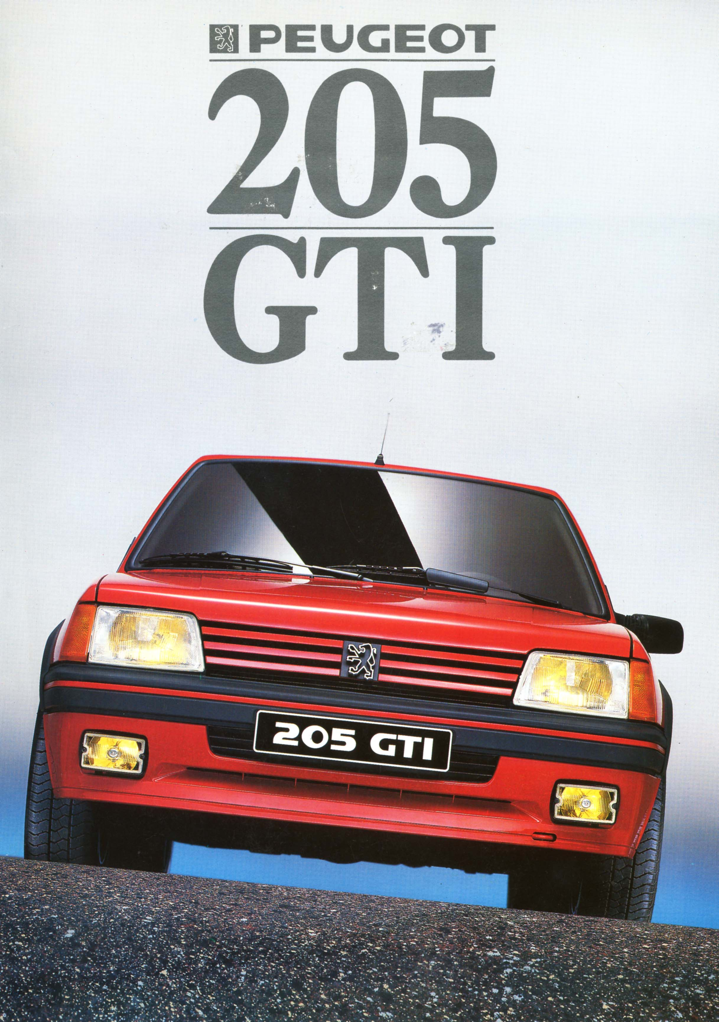
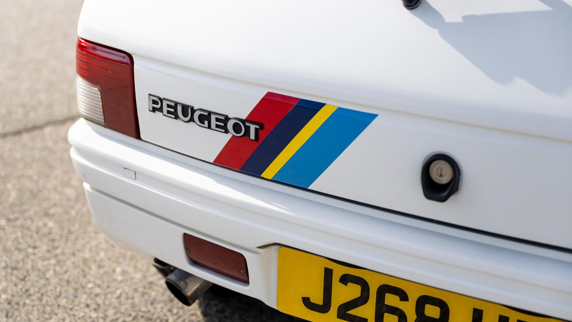
Out of all the new logos on this list, I kind of despise Peugeot's latest the most. It looks like it was whipped together for an esports team in about 10 minutes, and the black-and-white motif is so overplayed these days. If I were Peugeot, I'd bring back the aggressively '70s font and keep the lion visible in full. The graphic design of 50 years ago is probably the most in style it's been since, well, 50 years ago, so I figure it can't fail. It'd also be rad to see Peugeot Sport's iconic red, navy, yellow and sky blue make a comeback. Regrettably, the brand has dropped the ball there too, turning to highlighter yellow on its latest Le Mans prototype.
Brembo
We're not just coming for automaker logos today. Suppliers are just as guilty of these dead branding trends, and perhaps no recent redesign is more emblematic of that than brake maker Brembo's. The company's new look suggests with no words at all that it's been absorbed by Beats by Dr. Dre. And while that's likely not the first time you've heard that barb, it's such an astute and obvious one that it bears repeating at increasing volume until Brembo's leadership is deafened by the calls and forced to initiate a switch back to the old font just so they can sleep at night. That logo was perfect — the slanted cutaways in the circular letters called slotted rotors to mind, which makes sense because this is a performance brake company, not one that makes B2B software.
Audi

Audi hasn't noticeably messed with its logo in quite a while: 14 years, as a matter of fact. (Yes, 2009 really was that long ago.) But its decision to replace its distinctive logotype with something that vaguely resembles a stretched version of the Microsoft Office default was never a good one, and it's high time Ingolstadt did something about it.
Lancia
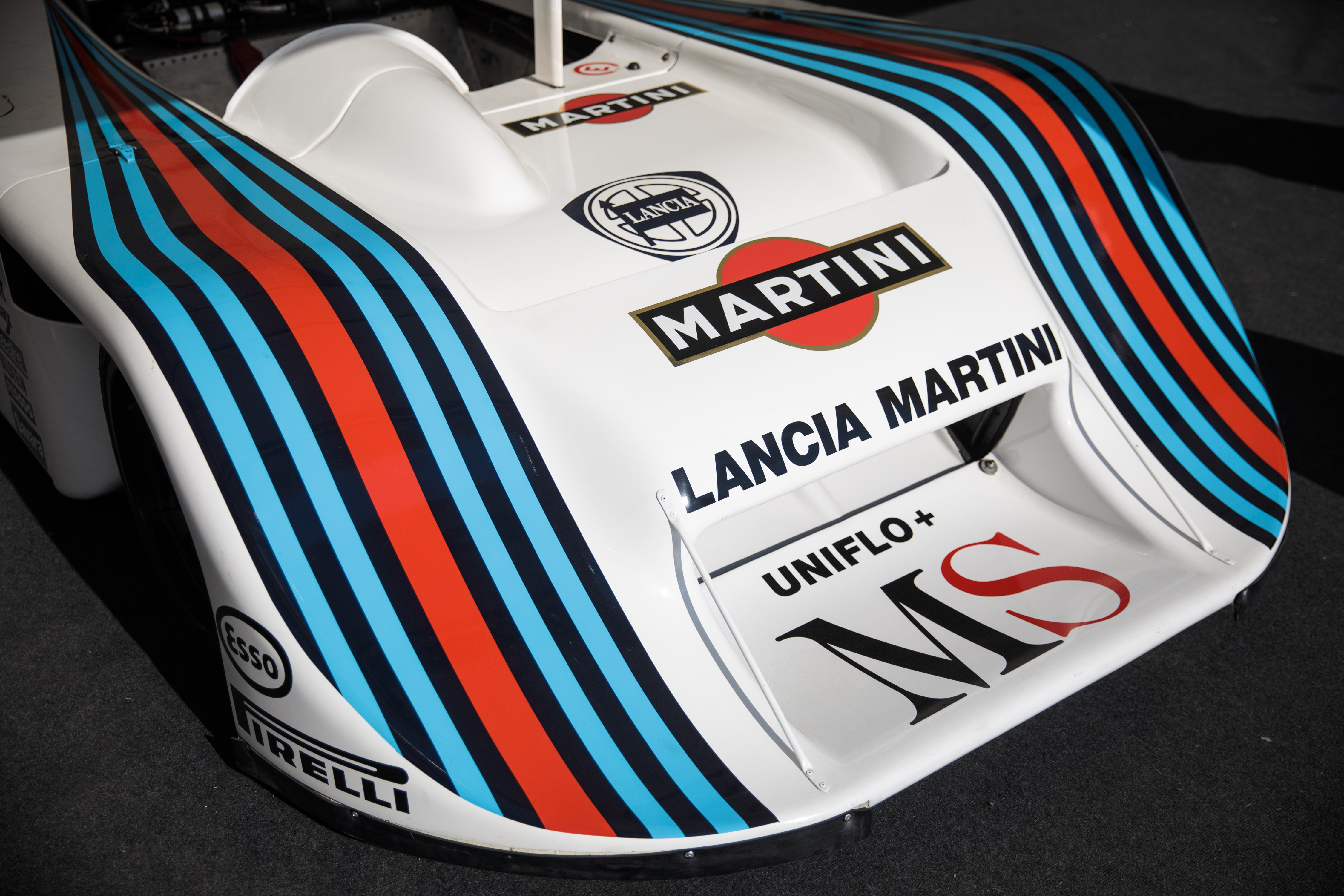
Lancia is going through something of a rebirth, though perhaps that's not fair to say until we actually see one of its future EVs in the flesh next month. Until then, we can only go on the Pu+Ra Zero concept, which is decidedly not a car — "oversized computer mouse" would be more apt. The brand's new logo is reductive and boring like so many are, so the easy solution here is to bring back the one on the Delta Integrale or the LC1 Le Mans prototype, seen above. Done and done.
Honda
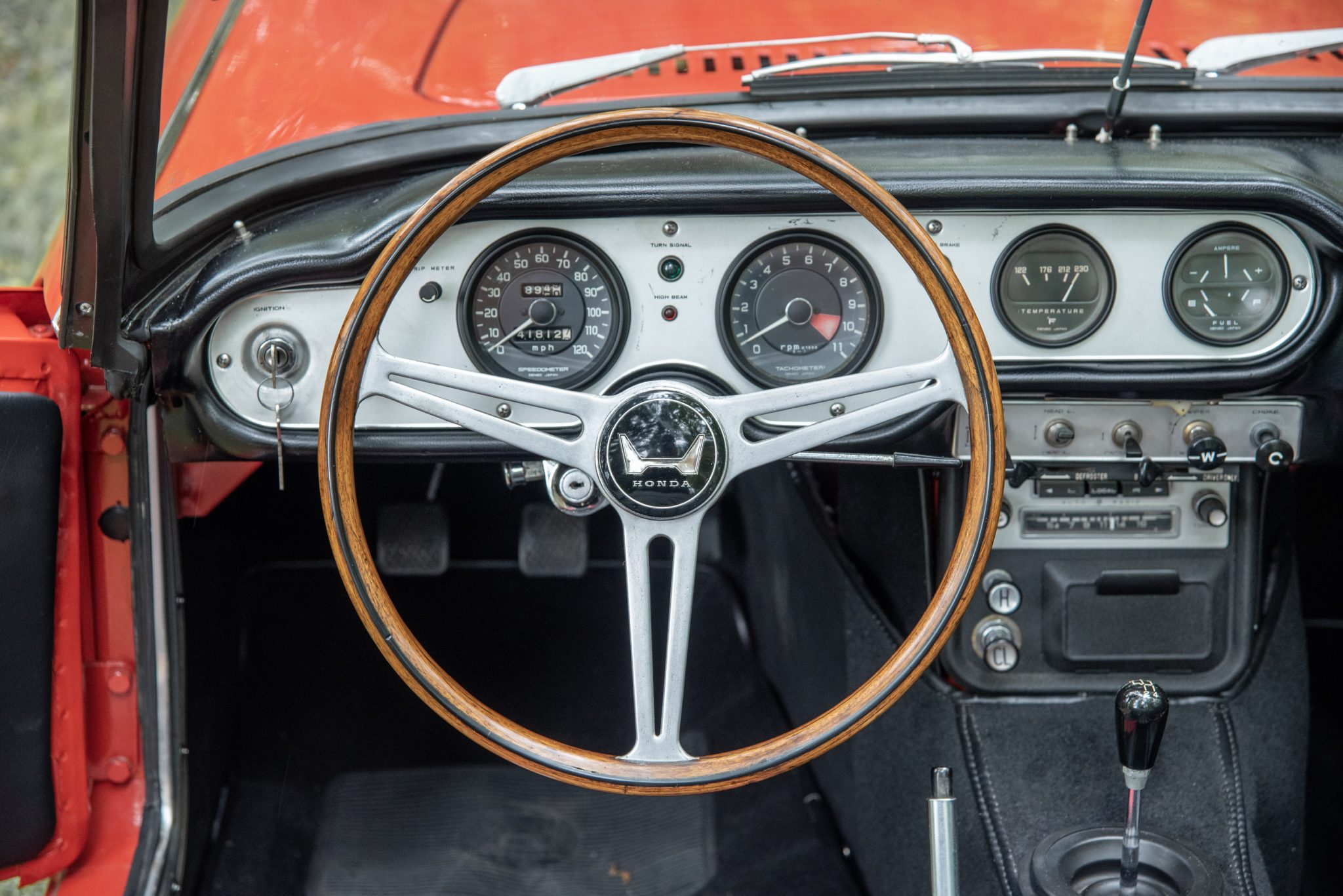
The Honda logo is timeless. Honda knows that, which is why it hasn't changed it in decades. But should it consider freshening up its branding, I have a suggestion. See, before the emblem we know today, Honda had a lean, wide "H," which appeared on some of its sports and racing cars back in the '60s, like on the steering wheel of the S600 you see above. And it looked sick. It's also the sort of shape that would translate moderately well to a grille design well because of its width. Not to give Honda any obnoxious grille ideas, of course.
Aston Martin
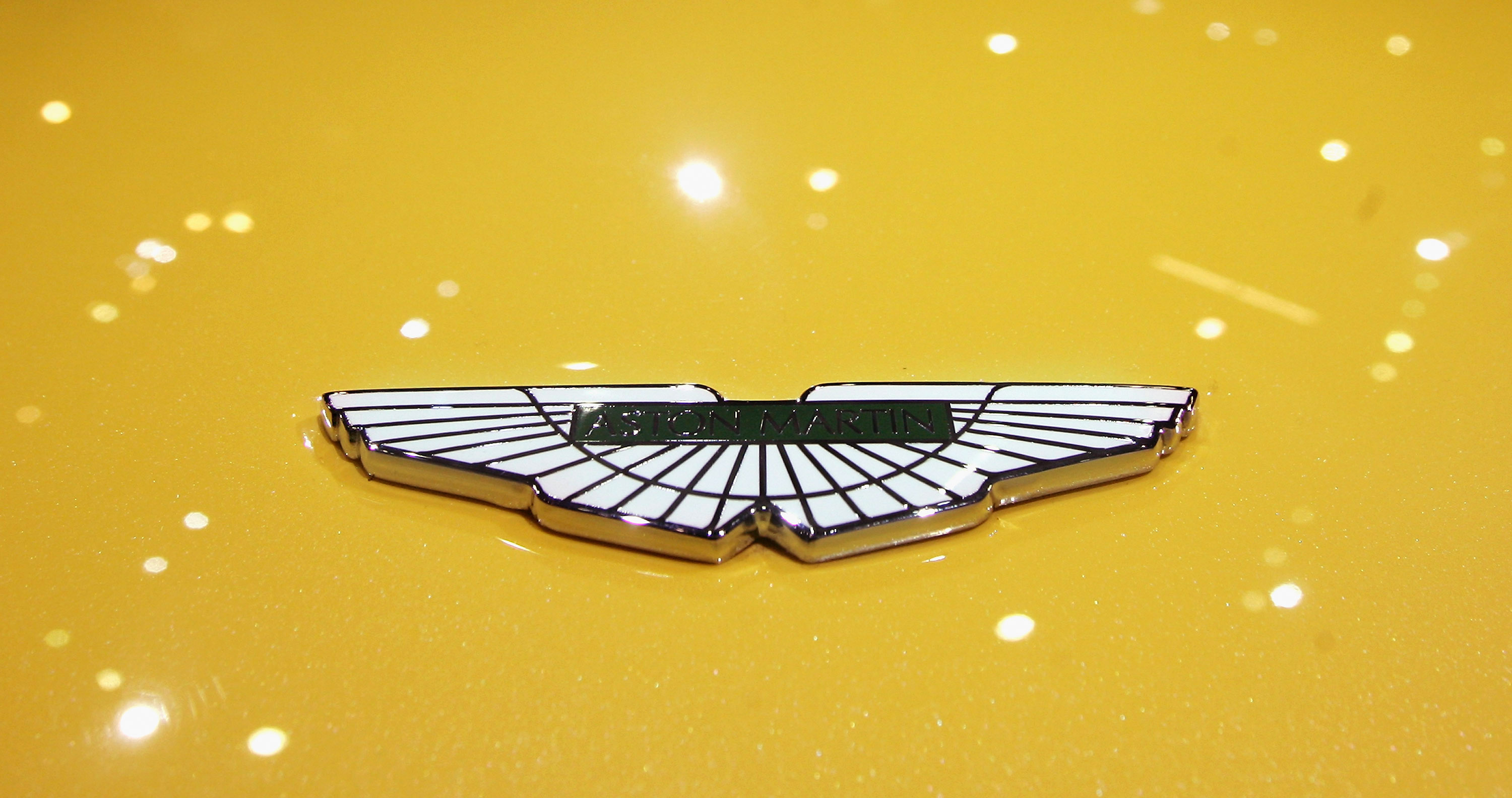
In 2020, Aston Martin tweaked its classic winged logo a bit to lose some lines and thicken everything up. It's not bad, as it's not even that pronounced a change. But still, why? I dug how delicate and intricate the old one looked. It's never coming back, but it really ought to.
Castrol
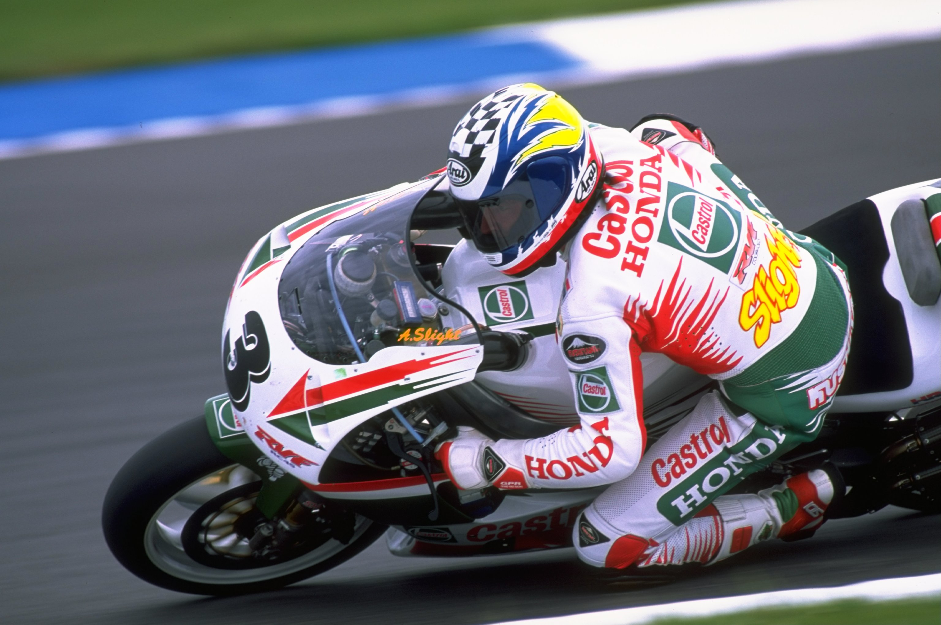
Much like what Brembo's done, this one breaks my heart. Castrol's old logos appear on some of the prettiest racing machines in history, many of them Toyota GT and rally cars and Honda motorcycles. The last big change in 2001 lost some of the magic, because it smoothed up the company's condensed logotype a little too much, but the latest one that dropped just weeks ago looks like nothing in its history — and not in a creative or attractive way. Are we pushing bottles of Pepsi or oil, here?
Citroën
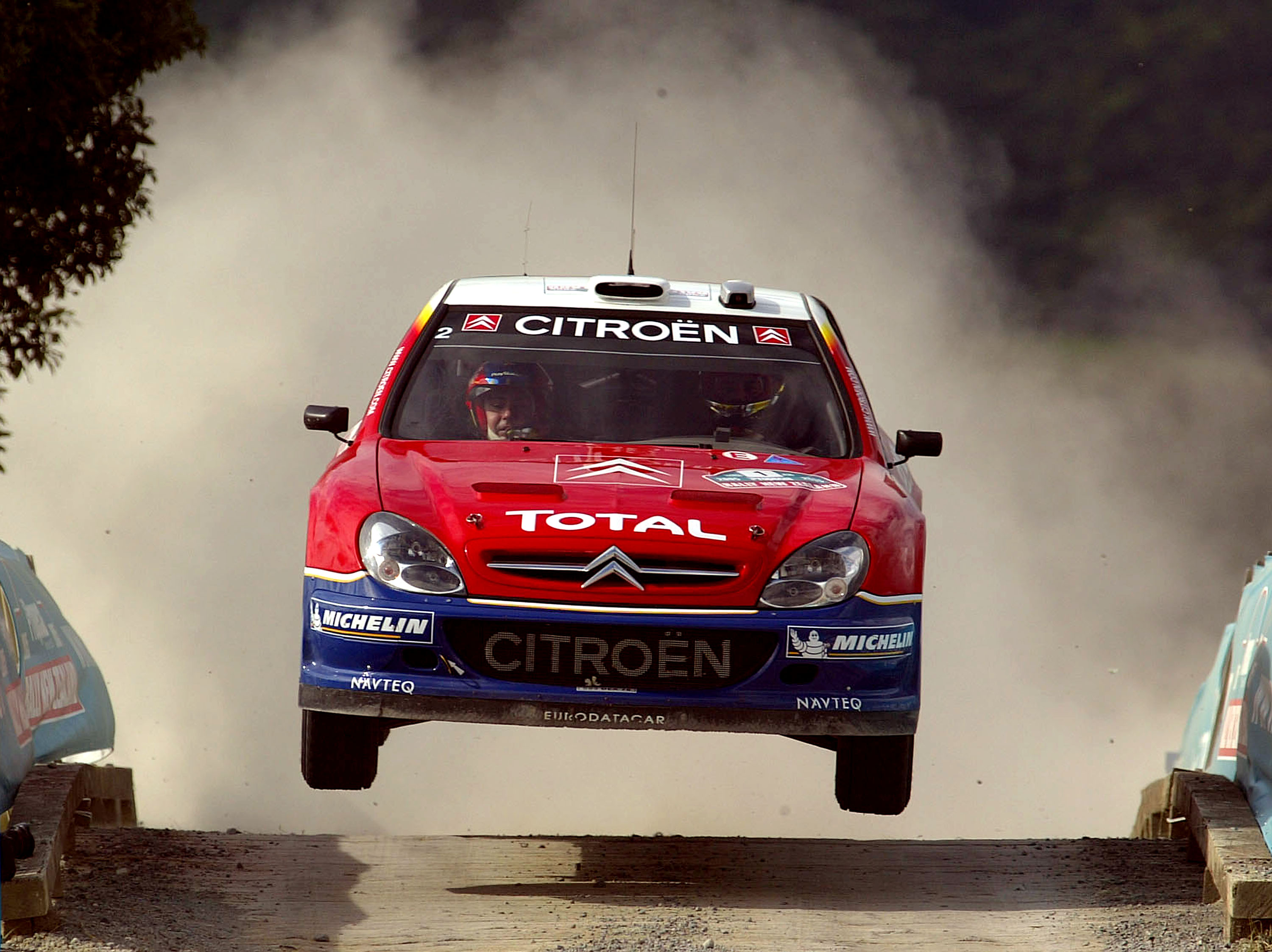
Perhaps it's a Stellantis thing, but Citroën's latest logo redesign, much like Peugeot's, tries to go for something historic but approaches the task with zero care for impact. The font is also desperately reaching for something edgy and futuristic, which guarantees it'll age horribly. The brand had it right with the blocky text and pointy chevrons encased in a stark red square — the very logo emblazoned on its World Rally Championship-dominating rally cars in the 2000s.
Volvo
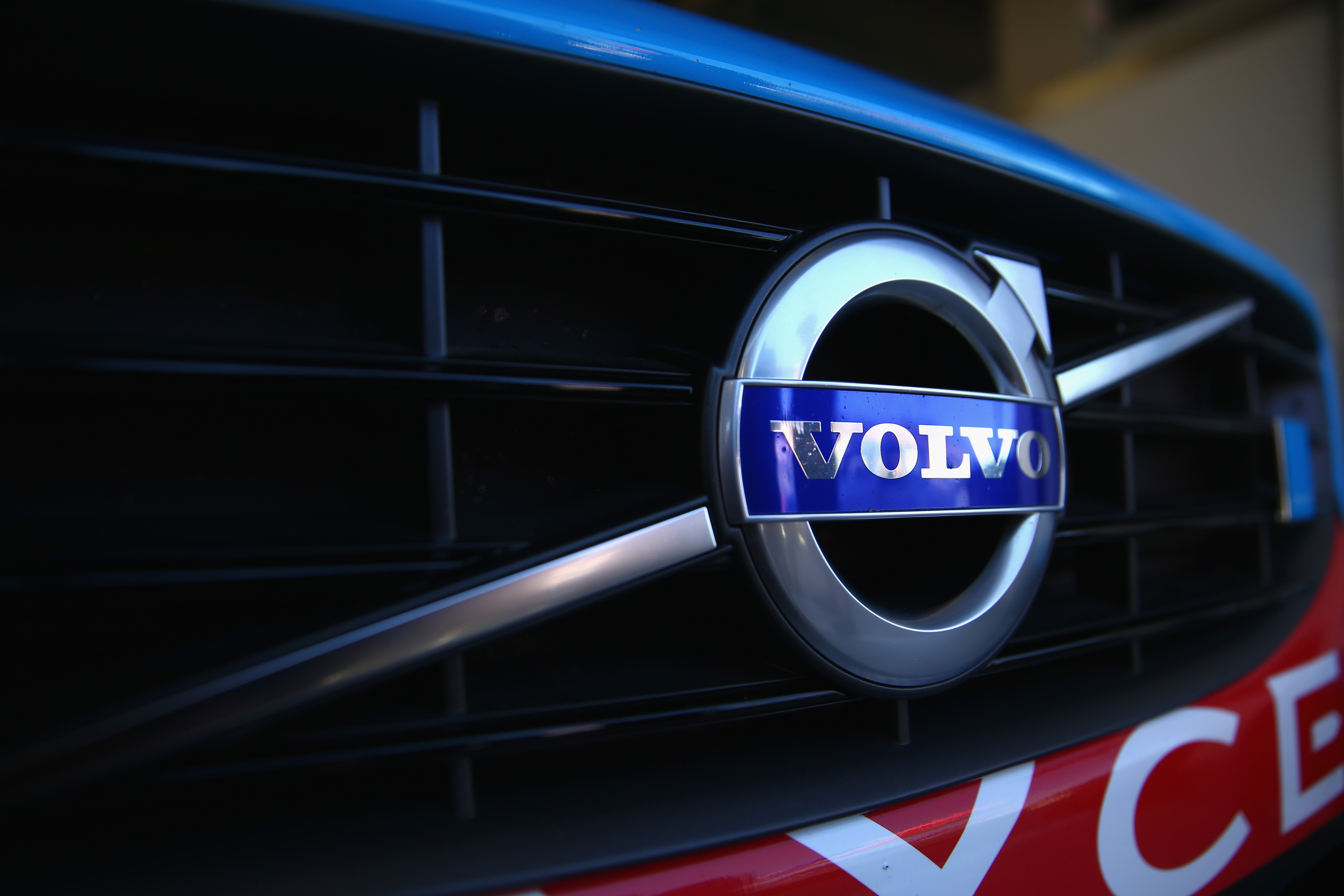
I'm of two minds about Volvo's leaner redesign. The preservation of the iron mark was necessary to the company's identity. I'm also pleased that iconic serif remains in place, at a time when everyone is ditching serifs left and right. But once again, we're reducing color and weight to the point where the name itself almost seems like an afterthought, floating in an expanse of nothing. It's not the worst, but it's also missing the solidity of the old badge, seen here on the grille of an Australian V8 Supercar.
Those are the auto brand logos that we think would benefit from turning back the clock. But what about you? Let us know what you think of these suggestions and raise your own down in the comments.