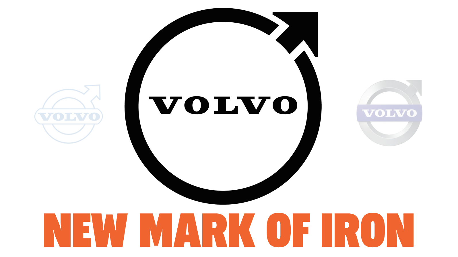
Volvo Updates Its Logo And I Think It Works
It's still essentially the same concept as they've always had, just cleaner and simpler
Thanks to an eagle-eyed reader named Steve who noticed this on Volvo's Facebook page, it appears that Volvo has updated its famous iron, men, and Mars-based logo into something flat and simple, in keeping with current graphic design trends. In general, logos tend to get simplified over time, and I think this latest revision distills the logo down to its essentials, and looks pretty good.
The change seems quite new, and looks like it hasn't yet been deployed to all of Volvo's sites, as you can see in the tiny tab-version of the logo, which isn't consistent yet:

Sources at Volvo have confirmed this is the new logo moving forward.
Before we dig into this new logo, let's look at the evolution of the Volvo logo since the company's founding in 1927.
The essential component of the logo, the circle with an arrow pointing to the upper right, was taken because it's the old alchemical symbol for iron, and also the symbol for Mars, both the planet and the old god of war, who trafficked in iron weapons.
This symbol was present on the very first Volvo car, the ÖV 4 from 1927.
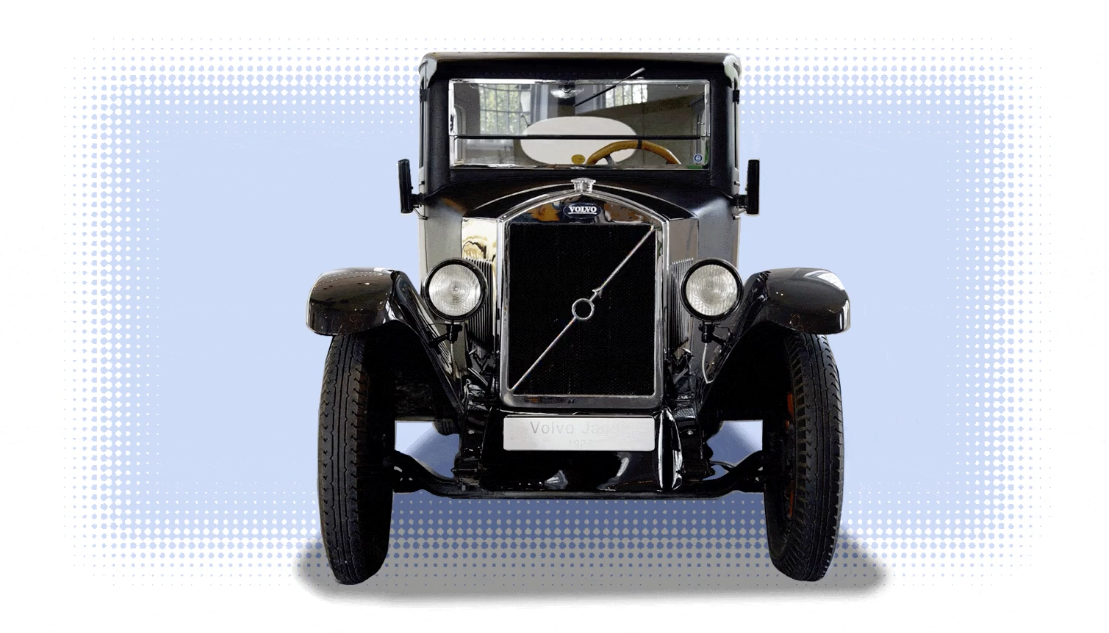
The diagonal grille bar it's mounted on is a whole other thing I've covered before; let's just focus on the logo for now. Mostly, I want to note the incredible simplicity of the original logo, just to remind anyone prepping a big speech about how they can't abide the modern flat, simple design movement that, really, simple logo design is not new. At all.
If we look at the progression of the Volvo logo since 1927, I think what's most noticeable is how consistent the company really has been:
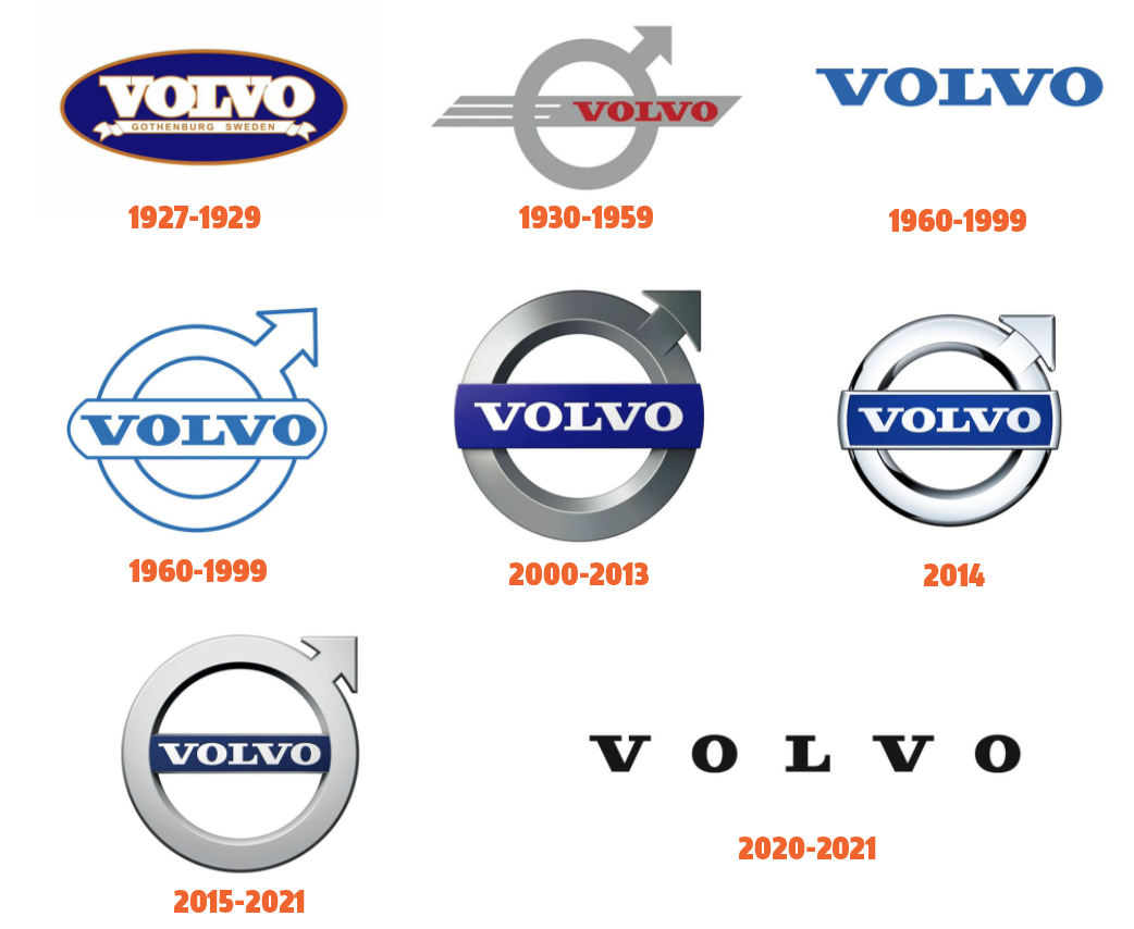
After some awkward typographic treatments in the late 1920s, by 1930 Volvo had locked onto the iron mark, with a rakish little speedy bar bisecting it with the typography for the VOLVO name that would continue until this day, where it's recently been used alone, with expanded kerning between the letters.
Sometimes the typographic logo would be used alone, usually on the back of Volvo cars to badge them, and there were a few times the typography changed, as in the more Art Deco-type lettering used on the early P1800 hood badges, that was eventually changed to the more conventional treatment (and stuck on a funny castle-like shield) on the P1800ES:
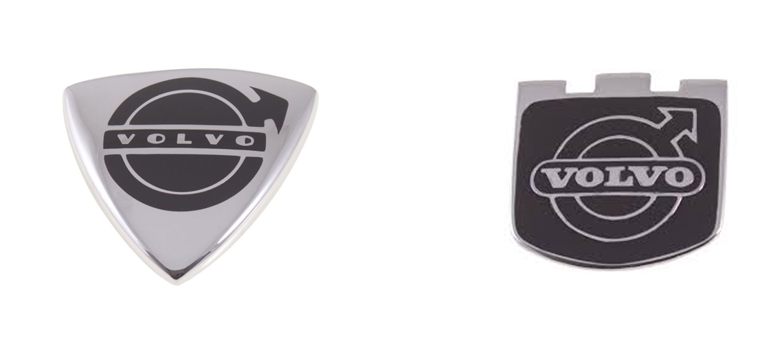
But, if you look at these, the iron mark has been quite simple the whole time.
Sure, things went a bit off the rails in the 2000s, when the 3D logo craze meant that the logo looked like a rendering of a physical, chrome badge even when printed on letterhead or a website. While that was the style of the time, I think those look pretty dated now.
In fact, speaking of badges, we've essentially seen the new logo previewed, in badge form, on the new Volvo XC40 Recharge front not-grille:
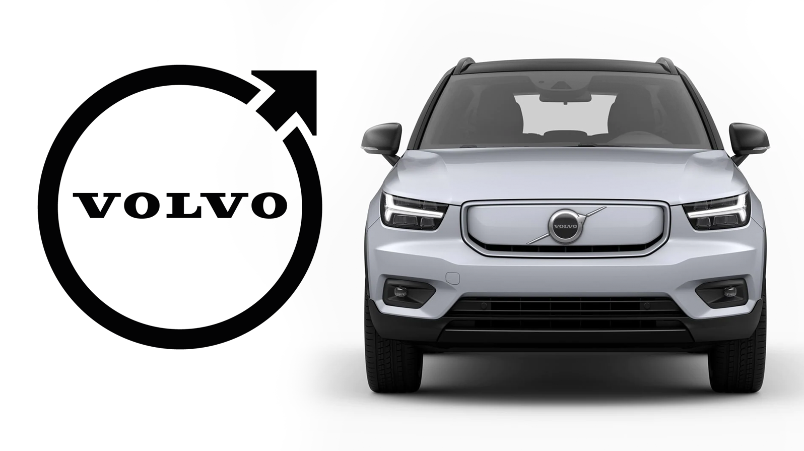
The recharge's badge has all the essential elements of the new logo: the deletion of the center bar, the arrow that's very close to the ring, with an arrow shaft that intersects the ring. The new logo is taking these same elements and translating them to a basic, one-color, flat representation, with the stubbier arrowhead breaking the outer ring, a detail that I think makes this logo work.
I think it works. Logos almost always tend to simplify and distill themselves over time, and a good logo should be immediately identifiable no matter the medium or scale it's rendered in.
This logo should work translated into a 3D chrome badge or on a website or stenciled on the side of a wooden crate. That's what a good logo should do.
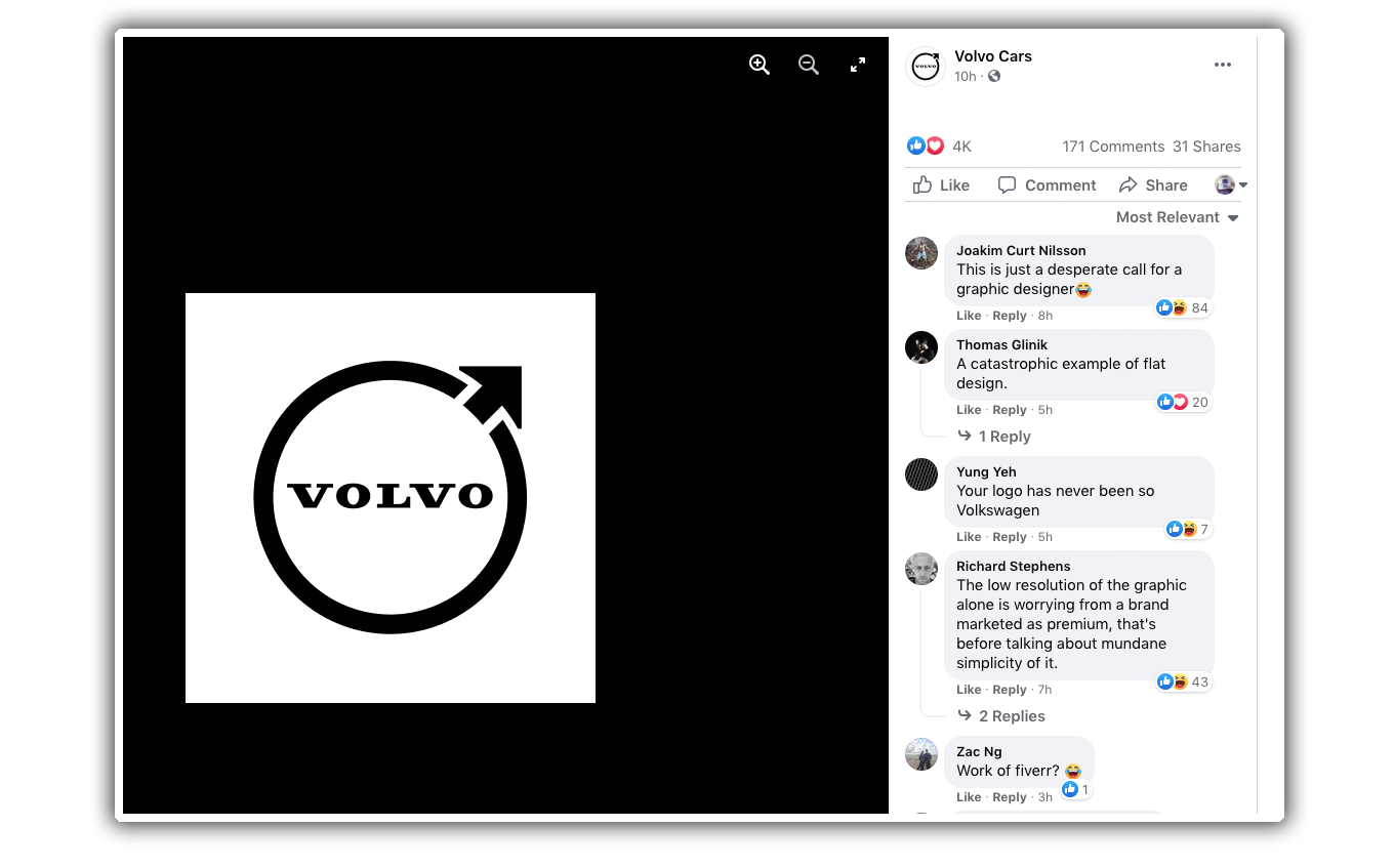
Sure, Volvo's Facebook page is full of knee-jerk angry comments from armchair designers calling it "catastrophic," but fuck 'em. This distillation to the absolute essentials of the logo makes good sense, and I think it'll work very well, in many contexts.
