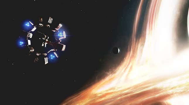
There’s an Easter egg hidden in the latest Nissan logo redesign. The logo alludes to Christopher Nolan’s film, Interstellar, and it may be proof that Nissan has become trapped inside of a time-warp and is desperately trying to reach its true self.
Here is the latest logo in case you’ve missed it:

And this is the massive black hole from Interstellar:

The logo redesign premiered along with Nissan’s new model, the Ariya. When seen on the car, it makes a decent impression, so I won’t judge Nissan too harshly. But the design language seen in the carmaker’s recent logo overhauls is boring, simply put. It seems that the ethos of digital user interfaces is making its way to car design, and carmakers have blindly obeyed its tenets, even if it’s not always been for the best.
I’ll choose the bold primary colors of decades past over our modern flat, monotone designs every single time. Carmaker logos are well into the same phase that factory paint options suffered through, where they have to mature in order to appeal to buyers.
Nissan’s outgoing logo began the transition to a more mature design:

But just look at the logo that preceded it:

When you compare them through a Spacelopnik lens, that new logo is the mirror image of Interstellar’s “Gargantua,” a black hole, while the older logo is the image of a red dwarf. The older logo is literally a star; it brings light to the world! All the latest logo manages to do is consume light and distort our perception.
Oh, Nissan, we know you’re trying. We can make out your ghost floating just behind that bookcase there, crying like Matthew McConaughey, pushing dusty owner’s manuals onto a barren floor, desperately trying to tell us something in a way we don’t yet understand.