I can’t help it — I get excited about new logos. Yes, I know they’re ultimately disguises that corporations use to instill the warm glow of familiarity and comfort within us, so they can later exploit that goodwill to extract money from us. But I’m a graphic design nerd, so I’m willing to go along with the ruse. (As if we have a choice, anyway.)
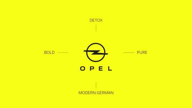
But there’s a worrisome trend developing among brands across many industries, and automakers are not immune. Opel has just introduced its new corporate identity, and much like the rebrandings Volkswagen and BMW publicized earlier in the year, this one changes almost nothing at all.
Well, at least that’s the way I see it. If you ask Opel flacks, they’ll tell you that the “legendary Opel Blitz” (raise your hands if you knew that was the name of Opel’s sideways lightning bolt thing) now sports a “fresh design.” There’s also a new logotype for the name itself, called Opel Next, which we’re told is “modern, expressive and consistent.” The list of changes continues:
The brand logo, which is now more finely drawn, the new “Opel Next” font and the bright Opel yellow signal the brand’s innovative strength. The goal: to be even more modern and courageous in appearance. Opel has always stood for the democratization of innovation and mobility. “New Opel” now expresses this spirit with its fresh corporate identity.
If there’s one thing I find amusing about carmakers’ push toward electrification, it’s that they’ve all identified some color that, to them, signifies sustainability and futurism. In lots of cases it’s blue. Sometimes, the blue is a bit lighter, a bit greener. Sometimes it’s even turquoise. In this case, Opel’s trademark yellow is now less gold, more fluorescent highlighter.

Truth be told, the new hue is the biggest change here. If I squint, it seems like perhaps the ring is the teensiest bit thinner, which may or may not make the bolt pop a bit more on a screen. The font is, to Opel’s credit, legitimately new and certainly modern. But expressive? What does this typeface express, exactly? That the company’s next move is selling drones on Instagram? I already miss the now-obsolete Opel Sans; with its rounded forms and angular terminals, it looked like something out of a beautifully illustrated 20th-century children’s book in a language I can’t read.
I suppose that says it all. The objective here isn’t to shock people, nor is it to totally upend whatever recognition Opel has earned. It’s to align the brand with the tech startups of the world, the figures associated with youthful progress and new blood. Personally, I find it derivative and feel as though it slightly cheapens a historic legacy, but to each their own.

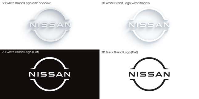
This isn’t to say all rebranding campaigns in the automotive world are necessarily unwelcome. Take Nissan’s stab at it, for example. This is a company with almost nothing to lose: Its sales are down sharply, its production has dwindled and although it’s revitalized much of its lineup, it still doesn’t really own any particular segment in which it plays. Nissan’s new logo is somewhat risky, in that it’s a dramatic departure from a design that’s been largely unchanged since the ’90s, but it also manages to be futuristic without venturing into overwrought or garish territory. I think it’ll age gracefully.

Opel’s “new” look isn’t ugly or offensive. It’s not as perplexing as BMW’s decision to delete the black background from its logo, making the letters objectively harder to see. The unrelenting push toward digital flatness that all manufacturers are obsessed with is expected, even if they’re arriving late to the party and the world is already moving on.
But Opel’s done the bare minimum here. It’s devoid of personality, no matter how desperately the press release attempts to convince me otherwise, and doesn’t deserve the superlatives attributed to it. It’s the same, but different. Maybe it’s wrong to expect anything else.