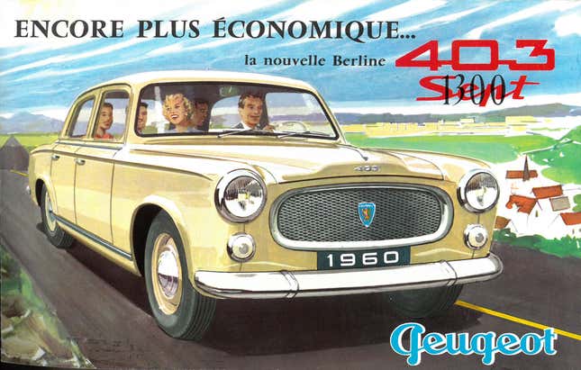
Hey! Welcome to a whole new week! Let’s start this one with a little mystery: what’s going on with the Peugeot logo? Why does the “P” look like a huge, lowercase “q?” Why is it backwards?
I checked around, and I can’t find a cursive/script capital P that actually reverses the direction of the “bowl” of the letter like that. The closest I could find was in the 1848 Spencerian script type, which included a “P” that looked like this:

Advertisement
I suppose that large loop could have been expanded and the bowl reduced to that tiny lump on the right of the Peugeot “P”?
Anyway, don’t laugh at people who read this as “Geugeot” or “Qeugeot” because that’s what it looks like.