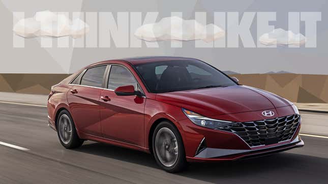
Earlier this week, Hyundai did something pretty bold: they unveiled an all-new four-door sedan, the latest version of the Elantra. In this era of everything’s-a-crossover-or-an-SUV, this once-expected act now qualifies as daring. Also daring is the design of the new Elantra which is striking and interesting and very likely polarizing, things which have never really been said about Elantras before. Let’s take a look at Hyundai’s new design direction.
It might be good to first remind everyone that the Elantra has not traditionally been an automotive design touchstone. If you can’t really remember what old Elantras used to look like, there’s a reason for that: why would your brain bother?
Here’s a first-gen Elantra, just as an example:

That may be one of the most aggressively and ruthlessly bland cars that I’ve ever seen. Hyundai has come a very long way since then with their styling, and they’ve absolutely developed their own distinctive design vocabulary and look.

Okay, let’s break down what we’re looking at, here. I know a number of sites are calling the new design direction “coupe”-like, but they’re all fools who don’t know what words mean. Really, this is more of a fastback sedan style, not a hatchback, because it isn’t, but rather a sedan with a trunk and an nearly-unbroken rear roofline that descends down into the trunk—really, in profile, it has more in common with a Citroën DS or a late ‘40s Nash than a coupé or a conventional three-box sedan.

The really interesting part I think has to do with the fundamental design vocabulary that’s being employed here. It’s fitting with a current trend among carmakers of more ornate, complex designs, incorporating a lot of creases, folds, negative spaces, often filled with fake vents, lights, or both, and dramatic, slashing character lines.
So far, I have not seen this implemented very well; Toyota is the worst offender here, developing a style I’ve called Cybaroque, which I’ve usually found to be overworked, confusing, and generally unpleasant.
Look at the current Prius Prime, for example:

There’s so much going on in that front end, with flaps and boomerangs and folds and creases and swaths of black plastic and lights and vents—it’s a mess, and, even worse, the cut and shut lines of the body panels just rake across everything with the ruthless abandon of ragweed.
Hyundai seems to have taken the same general enthusiasm for the level of detail, but I feel like has at least constrained things with an overarching aesthetic that, to me, feels inspired by low-polygon art:

If you look at the character lines in the side especially, it definitely has a bit of that low-poly look:

While I realize this may not be everyone’s cup of triangles, it’s at least a sort of connective visual theme, and I think it generally works.

The polygonal detailing continues into the rear, defining the shape of the C-pillar, the contours of the bumpers, and the design of the rear lighting.
It’s slashy and active, perhaps a bit kinetic and violent, if you’re in that sort of mood, but to its credit I do not find it boring, nor does it have the same used soap/suppository/river rock look of so many other cars on the road today.

The front end is interesting, too. Unlike, say, Toyota’s approach—or, really, most modern carmakers—the fundamental design is pretty simple. The big, bold grille dominates the front, like almost everybody’s does today, but the new Elantra seems a bit more content to let the grille really define things, and spends less effort on the below/side bumper areas, keeping things more coherent-looking.
Compare that to a Honda Civic, say

...and, why not, the new Toyota Camry:

I think the grille pattern on the new Elantra is well-chosen and continues the low-poly design theme, and the bold, very graphic pattern also helps the look of the non-grille middle section that houses and hides the bumper bar, though, disappointingly, the radar emitter window is a zero-effort glossy black panel just shoved on the lower front. Or maybe that’s the license plate mount? Either way, it could have been integrated better.

On the inside, I’d like to know more about this instrument panel design:

Is that a flat LCD screen with an open void behind it? If so, that’s an interesting choice. I am disappointed to see the skeuomorphic fake dash dials, though, as they seem out of place on the car and, of course, they could literally have been anything. That’s just software, though, so maybe there’s a way to change them.

I’m guessing this smaller screen with the physical knobs and buttons is the lower-spec model, compared to the glossier, all-touchscreen version:

...but I think aesthetically, I find that matte bezel and physical controls seems to fit the look of the car better. Maybe that’s just me.
What I like about what Hyundai has done here is that they’ve picked a coherent design theme and really explored it and applied it to one of the most normally staid classes of car, the mid-sized, mid-priced sedan.
The result feels modern and interesting, doesn’t look and feel like every other thing out there, and while, sure, it may become dated after a while, there’s no reason we have to fault it for that.

I mean, some of our favorite designs clearly evoke the era they’re from, and that’s what they should do—they’re honest to their surroundings and the influences around them. There’s nothing wrong with that.
I’m looking forward to seeing these on the road, in motion.
That is, if I can see them around the near-constant sea of SUVs and crossovers.