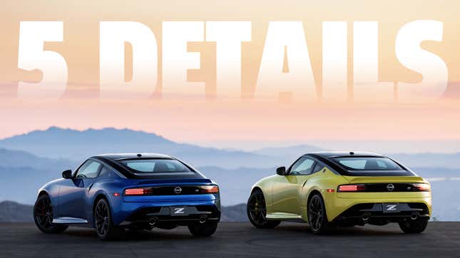
As you must know, tonight was the official launch of Nissan’s reborn Z-car, which they’re just calling the Z (at least in America), no more numbers. It’s a car very true to its 240/260/280/etc Z-car design roots, which I explored in some detail when the prototype—which looks just about identical to the production car—was revealed last year. Now that I’ve had a chance to peek at the new car, there are five interesting design details I’d like to talk about with you, because no one else around me will listen.
These five details are worth noting—three are interior design details, which I suppose makes sense as I’ve pretty much already seen the exterior, but the two exterior ones I think are worth pointing out.
Ready? Here we go!
This blue
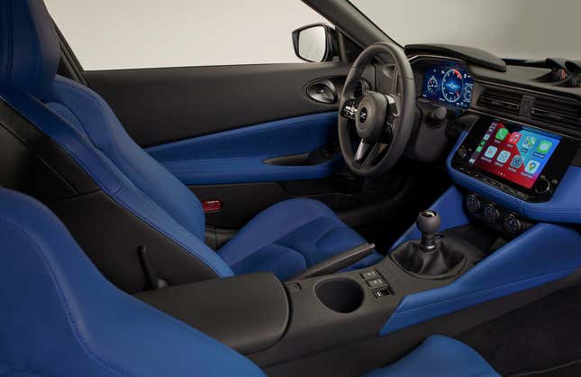
I actually paused when I saw this image and thought daaamnn, but in the best possible way, and it was all because of all that bold, unashamed blue.
Car interiors have been dominated by melancholy monochromes for far too long, so seeing such a bright, intense coating of color just feels amazing. And I have to hand it to Nissan for not just limiting the color to a few carefully-placed, timid stripes and inset panels—there’s blue slathered over this interior, and I love it. The door cards, seats, center console, lower dash, all in that royalest of royal blues.
It’s great, and I hope other colors get similar exposure.
These door vents
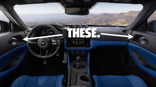
Normally, HVAC vents in doors tend to be just for side window defogging; I can’t recall another car that sets directional driver and passenger-facing HVAC vents in the doors themselves.
(Note: as many commenters have noted, this is not that uncommon, even appearing on the 350Z and some BMWs and other cars. I blanked on this. My apologies. Still, I like them.)
It’s actually a good location, too. Unlike most vents that would be dash-mounted near those sides-of-car locations, the door-based vents won’t freeze or cook your hands on the steering wheel, though I guess they might freeze or cook the interior door handles a bit.
Still, it’s a novel design I don’t think I’ve seen on another car, and that’s something right there.
Finally, some instrument creativity
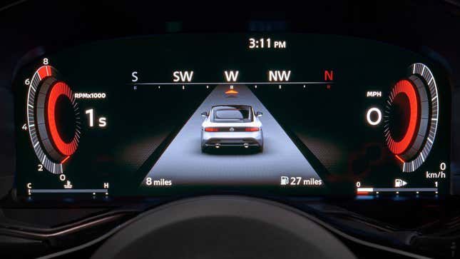
I’ve lamented how even in this era of full-color LCD instrument displays, we’re still saddled with silly recreations of conventional analog gauges for no good reason.
Recently, some carmakers have been breaking free of those skeuomorphic chains, making some graphically nice and very legible dash displays, but the Z feels like one of the first I’ve seen where the instrument designers really started to have some fun with the medium.
The tach and speedo here seem to be in the form of a pair of dimensional, floating gauge-like objects, sort of a physical representation, but still graphical, and not intended to look actually like constructed, material objects, but 3D objects that are unashamedly computer-generated and exist only in this sort of space.
I like them! They convey a high-tech, purposeful feel but with a sense of fun. I’m excited to see how they behave and look in action.
Also, a side note: does anyone else think it’s kind of weird they took this image that shows only 27 miles of range left in that almost-empty tank?
I know it doesn’t really matter, but it’s hard not to see that and get that oh-shit-I-better-get-gas feeling, which needlessly distracts from everything else. Couldn’t they have taken this shot when the car had like 3/4 of a tank?
Oh, what the hell, let’s look at the taillights
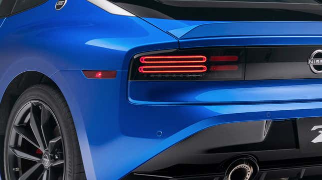
You didn’t think you were going to get away without some taillight talk, did you? Fools! Of course not! Let’s look at the taillight and rear marker lamp design.
The rear side marker isn’t bad—it hugs that seam between the fender and bumper cap, which is nice, but I think it could have been a little better. I’d have preferred a vertical one, hugging the crisp line of the corner where the fender bends into the rear fascia, I think?
As far as the taillights themselves go, I like them. The outlined twin sausages evoke the 300ZX, and I suspect under them, in that narrow band of LEDs, is the (hopefully amber) turn indicator, with the reverse lamp next to it, under the shorter twin sausages of the rear reflector.
I’m further glad to see the reflectors integrated into the main lamp unit as opposed to tacked onto the lower bumper, as is currently common and, frankly, kinda lazy. This is better, and the reflector will have a bit of good visual identity on a dark roadside.
The smoked lens over the lights works well, too, and fits the character of the car.
Grille problem solved
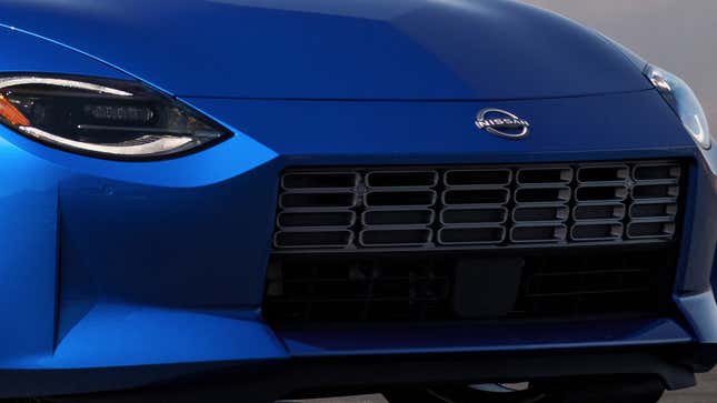
You may recall that when we were looking at the prototype, one commonly discussed sticking point was the front grille, which had a black-on-black design that made it look a bit like a rectangular, yawning chasm of nothingness.
I thought maybe a bumper blade bisecting the grille might help:

...but I think Nissan’s solution is much better: make the grille mesh more visible!
As you can see, the grille now has a silver mesh of oblongs that sort of echo the sausage shapes seen on the taillights, and gives that front end some nice visual texture.
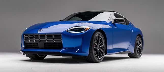
It’s effective and simple and puts just enough visual interest on what’s otherwise a very clean, unadorned design. A good solution.
Thanks for indulging me in these details; I’m sure there’s more to note on this thing, and if this quick glance is any indicator, I’m eager to dig into it more.