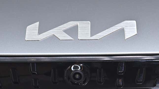
Back in January of 2021, Kia introduced a new logo. Instead of the old oval with KIA written clearly inside, this new logo asked a question no one needed answered: What happens if we connected all the letters in one continuous jumble? The decision has continued to leave people confused, as one Redditor has shown.
u/Deus-system-failed posted a very valid question on the r/nonmurdermysteries subreddit earlier this month. Its title was quite simple, reading just “KM Cars?”
“Have you ever heard of a KM car?” the post began. “Neither have I and I haven’t the slightest idea when or where they come from. Google doesn’t give me anything useful at all.”
The post continues:
I’ve saw them twice in Upstate SC both times on car transporters, close to inland port both times. Sedans and SUV’s neutral colors like red, gray or black and no discernible features besides the large silver KM logo on the backs. They were headed North both times, they appear to be brand new.
Not super interesting but something nonetheless, I’ve seen hundreds of car brands and from what I can tell none are remotely related. Perhaps I saw a prototype of a merger vehicle, it’s been discussed before but are generally unpopular as most manufacturers are in direct competition.
Other users kindly let u/Deus-system-failed that this isn’t a new vehicle or a prototype; this is just the new logo from the Korean brand that is just now starting to become more prevalent.
I can’t fault the Redditor for not knowing what the logo said. I’ve seen a few new Kias in parking lots when I head to the grocery store, and I’ve needed to do a double-take every single time I see one.
Kia's reasoning behind changing the logo is that it's drastically changing its cars. No longer does it want to be seen as an underperforming budget brand. With the kick-ass, updated Telluride and Stinger, it makes sense that the company would want to distance itself from its past. But this new logo is definitely going to take some getting used to.