The new Wagoneer and Grand Wagoneer are the most luxurious vehicles Jeep has ever built. Love them or not, the prospect of a Jeep that starts at $90,000 is sort of jarring, though it’s a testament to the brand’s growth that Stellantis evidently feels confident it can sell such an opulent full-size SUV.
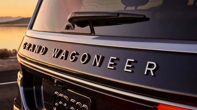
Which leaves me, typography nerd that I am, wondering: Why did Jeep phone it in with the logotype for these vehicles?
If the typeface Jeep is using looks familiar, that’s because it’s quite a popular one. Called Gotham and designed by Tobias Frere-Jones for GQ magazine, this font family was first published in 2000. However, Gotham didn’t rise to prominence until Barack Obama’s 2008 presidential campaign — or, more accurately, the iconic Hope poster created by Shepard Fairey.
Those uses basically cemented Gotham as the typeface of the 2010s, for better or worse. MSNBC, Saturday Night Live, Netflix, New York University and the late-night talk show Conan are just a few among the many entities that relied upon Gotham’s “grotesque” strength and modern-yet-mature form to cultivate new identities in the previous decade.
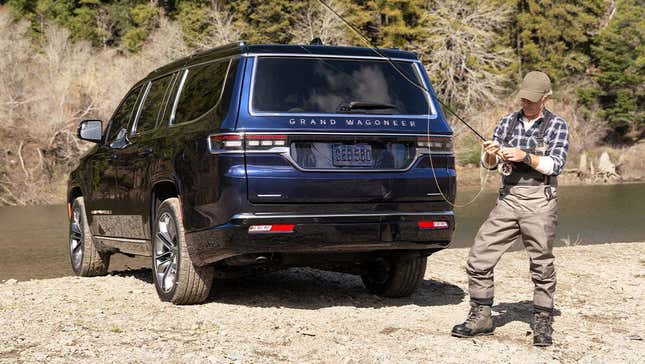
But that moment’s over — or, at least, it feels like it is. Once everyone starts pulling from the same cultural touchstone, it’s no longer trendy or fresh, and that’s sort of what’s happened with Gotham. Evidently, though, it was still good enough for Jeep, which decided a widely-spaced and lightly modified version of Gotham would lend an air of sophistication and luxury to the Wagoneer’s brand.

I say “lightly modified” because eagle-eyed readers will notice that Jeep has diagonally sliced where ends of the “G” and “E” characters terminate, for an edgy little tweak. It also appears that the middle bars on the “E” have been lowered from their normally central position, for a slightly more art-deco aesthetic. Otherwise, though, this is basically Gotham as we’ve all seen it before.
Now, it’s not that I don’t think Gotham fits with what Jeep is going for with the Wagoneer; there’s a stateliness to this typeface that Jeep’s probably angling for with its new flagship. It suits the forest’s worth of wood Jeep is using inside this thing, and the abundance of warm, diamond-quilted leather. But it’s still a generic choice, which gives off the impression not much thought was invested into it.

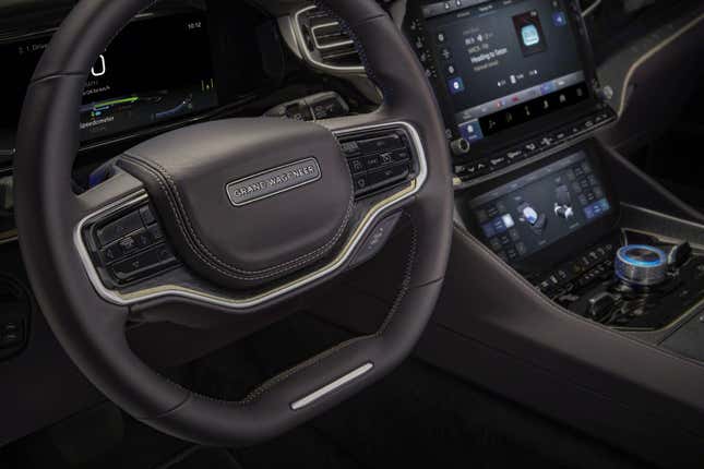
While I like the decision to spread the nameplate wide across the tailgate, the way it’s incorporated in the steering wheel, set inside a rounded rectangle, looks very tacked on and a bit lazy, like it was generated using some online logomaker tool. Jeep would have fit much better in this spot, though I assume the reason the designers didn’t go that route was because they wanted to attach prestige to the Wagoneer name by placing it in such prime real estate in the cabin.
So what would I have preferred Jeep done here? I don’t have time to whip up my own proposals, but I probably would have gone with one of the classic sans-serifs that likely inspired Gotham, like Futura or Akzidenz Grotesk, that are historically significant but not as commonly used today. Even Raleway, a free Google Font, would have been a better choice as it’s basically Gotham, but with a neat crossed-V design for the W that would have stood out.

For something more modern, maybe IBM Plex Sans? Or something proprietary and designed in-house. Alternatively, Jeep could have gone tough and blocky, like Land Rover or something, though I get the sense that the objective here was a classical, more understated elegance.
Really, I would have preferred anything I’m not as used to seeing as Gotham. But enough of my whining: Am I onto something here, or does Jeep’s choice look totally fine? Or is arguing over typefaces on a six-digit SUV I’ll never be able to afford totally pointless?