Automakers just don’t have enough fun when it comes to outfitting their cars with good-looking colors. When I prowled the show floor of the New York International Auto Show, I was not impressed by a vast majority of car colors—everything is either eye-searingly bright or a horrible, boring rental-car shade of gray, and we’re just completely ignoring the artfully colored middle ground.
Blessedly, there are a few automakers out there who are doing something right and giving us the classy color we deserve.
The world is slowly being taken over by black, gray, and white cars. If you were to take a bird’s eye view of a highway from above, you could reasonably think you were looking at a black-and-white TV—and society has long been rid of those when we moved on to bigger, better, more colorful things.

I’m a fan of color and creativity. Call me shallow, but when I’m in the market for a car, I want it to be something that looks as good as it feels when I drive it. I want the very appearance of my car to bring me immense amounts of joy every single time I lay eyes on it when I walk out to my parking lot. And that requires color.
I recognize that some people just don’t want their car to stand out too much. It’s not just some urban legend—brightly colored cars are usually more likely to get pulled over than their grayscale counterpart.
But when there is color in the automotive world these days, it’s often ostentatious, absurdly bright shades of supercar-grade neon. And if it’s not that, it’s back to the forgettable grays.
There has to be a happy middle ground: something with just a touch of color to keep things classy, but not too in-your-face.
Hyundai’s Sierra Burgundy shade that comes on their Palisade is, to me, the ideal color. It stuck out immediately on the show floor—not in a “look, an obnoxious car!” kind of way, but in a tasteful hum and nod of appreciation kind of way. It’s neutral in that it makes you feel warm and cozy, not bored out of your skull.

I see it less as burgundy, more as a plum—but nevertheless, it’s good. To me, it gives off plenty of purple vibes, a color that’s been severely lacking as a paint shade. If it’s not plum crazy, it’s not anywhere near a car. Which is a damn shame, because this Palisade looks like a gorgeous formidable beast outfitted in that shade.
It’s a similar story with the Audi R8 V10 performance coupe that comes in the metallic Ascari Blue. It’s almost navy-looking, and it isn’t as terribly obnoxious as you’d expect a metallic blue car to be. It’s another great option for someone who wants color but wants to be cool about it.

Again–look how classy that shade is. It’s not an in-your-face neon. It’s not obnoxious. It doesn’t give me a migraine the moment I look at it. But it also doesn’t just blend into the crowd like a gray counterpart would.
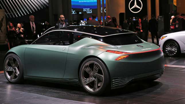
And then there was the Genesis Mint concept. The beautiful, beautiful Genesis concept.

This one is great, and what I hope is a look into our elegantly colored future. Green is one of those colors that can be tough to pull off on a car. Too bright, and you look like the kind of bro who revs their very loud engine through my 15 mph parking lot at two in the morning. Too dark, and you may as well add some netting and ship off for war.
Genesis found the perfect blend here, which is tough to do when also opting for matte paint. The Mint has just enough blue tinting its forest green to keep it from looking too militant. The result is a pretty spectacular shade that doesn’t throw itself in your face but does ask you (very politely) to give it an appreciative once-over.
I need more automakers to embrace the muted color trend. Take pride in your product and give it the handsome, classy makeover it deserves so that I can have twice as much fun driving it.