Badges and logos are supposed to be simple symbols or graphics that are meant to represent something else, and in the wonderful world of capitalism, brand recognition is important. Having an easily identifiable logo means consumers are subconsciously aware of a company’s presence. Last week, we asked you lot what cars have the coolest logos or badges, and you did not disappoint. From elaborate animals to single letters to celestial constellations, your answers ran the gamut. There were lots of great answers left in the comments, so if you’re a real logo freak, then I suggest you go back and check them out. These are the cars that the Jalopnik audience thinks have the coolest badges.
These Cars Have The Coolest Badges And Logos
A well-designed emblem is a total boon for brand recognition and emotional connection
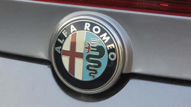
Alfa Romeo
Low hanging fruit: Alfa Romeo.
Snake. Eating a dude.
Submitted by: dustynnguyendood
Not quite the real lore behind the Alfa Romeo badge, but it really does look like the snake is eating a little dude.
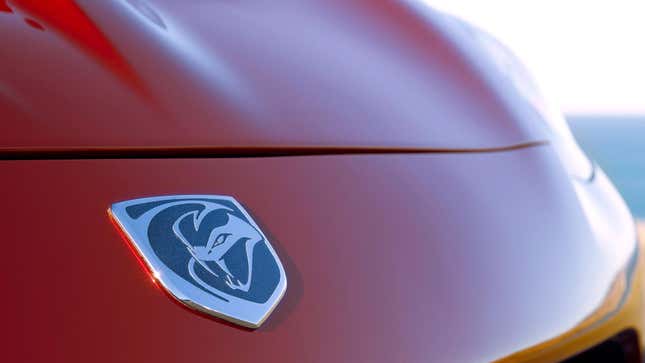
Dodge Viper
Snakes are cool. I like all our snakey boys, and would like some future psychotic 2000 horsepower EV snake with yet another cool logo too.
Aggressive cars deserve aggressive logos, and the Viper was most certainly both of those things.
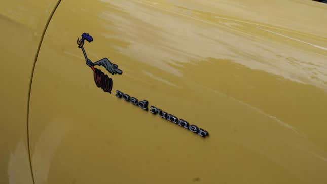
Plymouth Road Runner
They Road Runner Super Bird...classic.
Along with the other Mopar cartoon cars: the Duster, Demon, and Super Bee.
Ah, the Plymouth Road Runner. All I have to say are two words: meep meep!
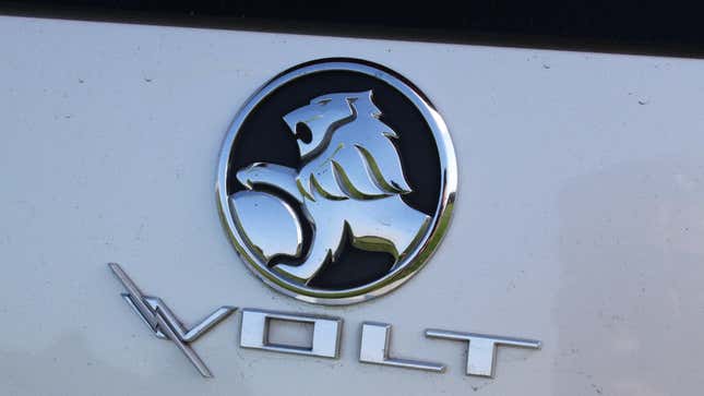
Holden
I’ve always liked the Holden logo.
The Holden lion means business. I don’t exactly understand how Holdens are in any way reminiscent of a lion, but it is a cool logo.
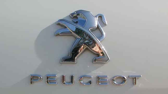
Peugeot
I like the Peugeot logo.
I am so glad someone said this. The Peugeot lion’s karate era will never not be in my brain. What do you think, is the lion doing karate or the Thriller dance?
Jaguar
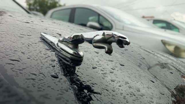
I guess it’s technically not a badge, but Jaguar’s leaping jaguar hood ornament will always be my favorite:
I think the pouncing Jaguar absolutely deserves to be on this list. It’s the perfect degree of stylized, and its smooth sleek profile is absolutely reminiscent of the cars it graced.
Pontiac Firebird
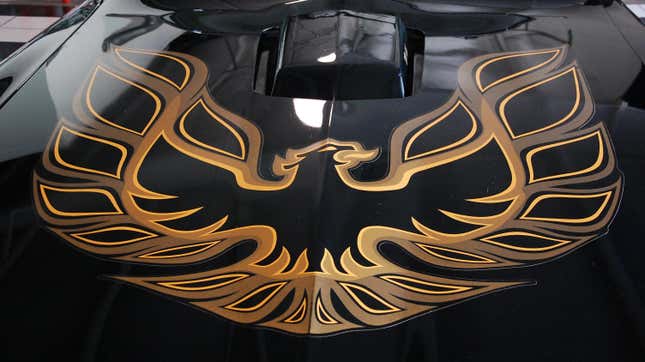
Only one car has had a logo so righteous it needed the whole hood.
I somehow didn’t even consider the screaming chicken, but it is a great and very valid answer.
Subaru
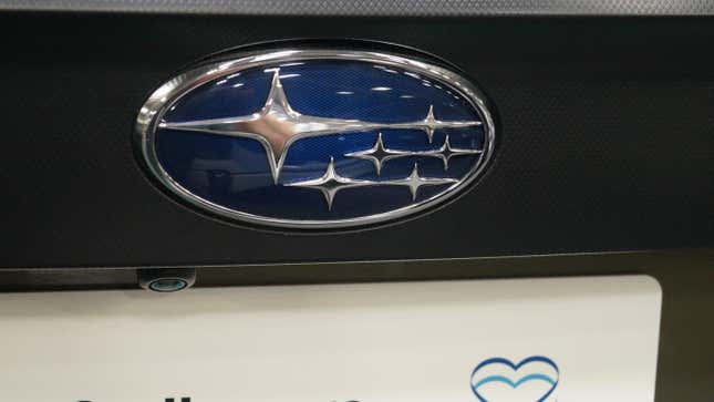
As a certified Space Nerd, I have to go with Subaru. “Subaru” is the Japanese name for the star cluster called the Pleiades, and that’s what’s on the logo. It’s somewhat stylized; the current logo is not a very accurate depiction. Earlier variants of the logo were a bit more accurate to the positions of the stars in the cluster as seen from Earth. The current version is more reflective of the symbolism of five companies merging together to produce a sixth, larger company.
Since the shuttering of the Saturn brand, it is now the only car make with an astronomical logo.
Thank you for nerding out with us!
Saab
SAAB
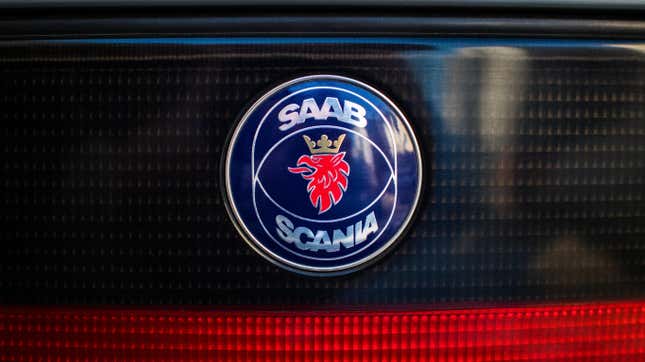
There was lots of love for Saab’s various badges over the years, but I went with this photo. Older Saab badges were more reminiscent of the company’s aviation history, and man were they cool. We miss you, Saab.
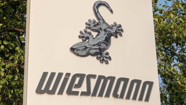
Weismann
Obscure but awesome, the Weismann Gecko.
Totally niche and totally rad. The Weismann gecko has to be one of the more obscure animals to ever represent a car company.
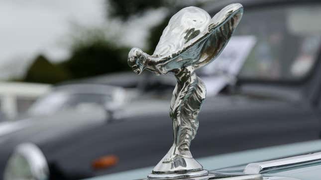
Rolls-Royce
The Spirit of Ecstasy may or may not be the coolest badge... but it’s definitely the badge with the coolest name. I mean... do any of the other badges have names?
The Spirit of Ecstasy is one of the longest-standing and most iconic hood ornaments ever. And you raise a great point about its name!
AMC’s Various Badges
I was always partial to AMC’s logos
Javelin
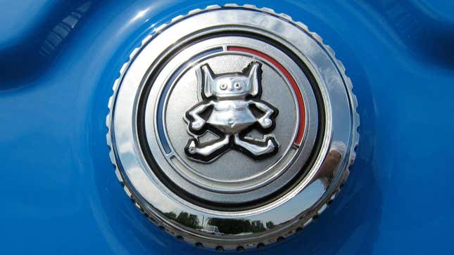
Gremlin
Hornet
Pacer
Well.... they can’t all be winners.
Submitted by: Earthbound Misfit I
The cartoon-style emblems for American cars in the late ‘60s and the ‘70s are such a weird phenomenon. The Gremlin’s mascot dude is too cute for me not to post. Just look at it!
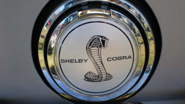
Shelby Cobra
Hard to top good old Shelby’s snake.
I used to have a pet snake when I was a kid so I am a fan of them, but I wouldn’t mess with a cobra. It’s a great badge for a great American performance car company.
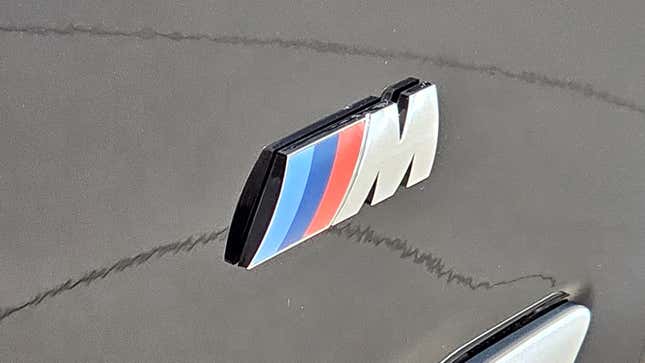
BMW M
The Jaguar and Alfa answers were my first two thoughts, but I also have an appreciation for the simplicity and endurance of the ///M Logo. The 3 colors and one letter can even be separated and you still immediately know what it’s referencing. It’s been around for 50+ years and shows no signs of going anywhere.
BMW may have been guilty of diluting the provenance of M on occasion, but otherwise I think they’ve done a great job of building a brand within a brand. I have loved all of my M cars and on my non-M BMWs I really appreciate some “M” touchpoints.
Normally I wouldn’t agree with this answer, but your argument about its identity being linked solely to the three colored stripes was quite compelling. While it may not be the most exciting logo to look at, it serves as a religious figure to some.
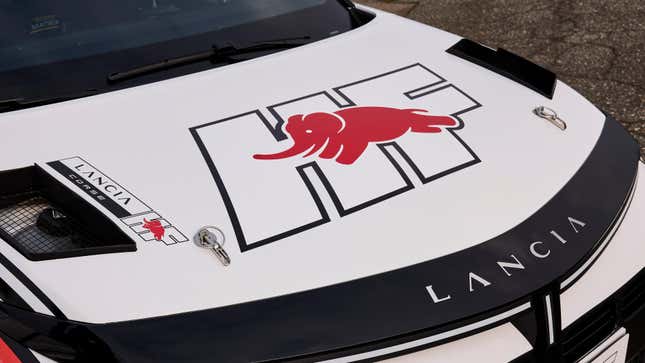
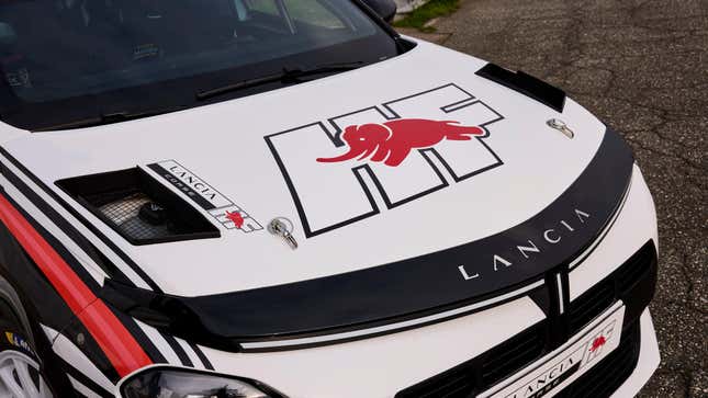
Lancia HF
I’ll make another nomination, just because it tends to be a bit more obscure.
Lancia HF logo.
I didn’t know that Lancia had a freakin’ smiling and leaping elephant on its HF badge. Thank you Featherlite for pointing this out. Where most cars have aggressive, intimidating logos, this adorable fellow is just stoked to be gallivanting about and I love it.