There’s no operational reason to put a lot of thought into say, making a side mirror or a reverse light beautiful, but that eye for detail is what makes good cars great.
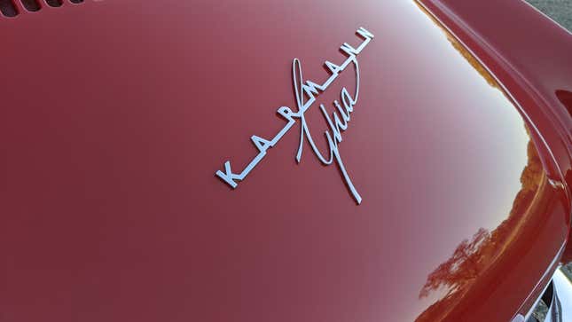
A font can do so much work in such a small space. One of the reasons I have always loved the Karmann Ghia is because the badge has not one, but two fantastic fonts. The spaced-out letters in “Karmann” give the badge room to breathe. It makes you think of the open road, of all the space that awaits you. The straight-across letters are as stately and no-nonsense as the German company it represents, while the loopy Italian “Ghia” immediately lets you know this is a car with flare. Ghia is just long enough to make the script interesting without being overwhelming. The way the G intersects the “Karmann” is an especially satisfying touch as is the way the last “a” just barely touches the second “n.”
It’s a cheeky font. You’d think that the blockiness of “Karmann” and the swirly script of “Ghia” would clash, but they set each other off nicely.
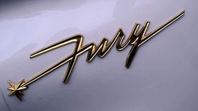
Another good example would be the Plymouth Fury, which just looks like it was written by someone rushing to sign a restaurant bill so they could go punch someone they saw walking by in the face.

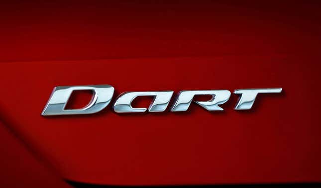
It communicates so much about what the designers intended! Now let’s compare this to a badge font I viscerally hate. The revived Dodge Dart:

Boring. And this close up makes it look so much better than when you see it on while driving. When I spot this on the road, to me, it looks like Dort. The Dodge Dort. If your font can’t even effectively communicate the name of the car, it isn’t communicating anything else either.
It’s not just badges that can be amazing. There are engine labels, graphics, or decals that can count as extremely good examples of font. It just gives my brain a nice shot of endorphins to see words looking good. Celebrate the little details that make cars great by dropping your favorite examples in the comments.