Volkswagen's New Logo Is Its Old Logo
Volkswagen's basic logo design has remained fundamentally the same since the 1940s, with only minor changes over the years like taking off the bits that looked too swasticky or varying the thickness of the lines. Nothing too major, until 2000, when it went to a three-dimensional, gradient-shaded logo that was more like an illustration of a physical badge than a logo. It now appears it's going back to the flat, simple logo, much like the one it was using in the 1970s.
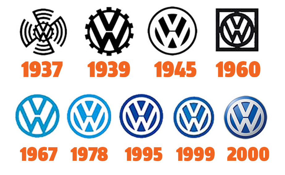
Keep in mind that those first two iterations of the VW logo there were from the KdF-era, and as such pre-date the start of Volkswagen as the company we know today, which happened after WWII.
Autoweek reports that the new logo will be officially unveiled at the Frankfurt motor show next month, though VW has been showing the logo other places already, without any fanfare.
The final frame of its Hello Light commercial for the upcoming re-born Microbus shows the new logo, along with the current, dimensional logo as a watermark in the lower right corner:
As far as logo changes go, this is really a quite mild change, and one that fits with the overall design aesthetic of our times, which has been moving away from skeuomorphic designs in favor of more flat, simple logo designs for a number of years now.
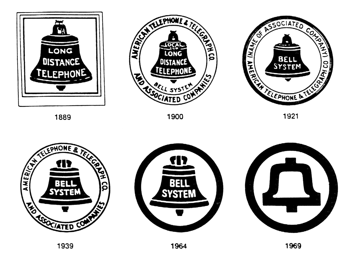
Really, this makes for a better logo, anyway. In general, logos tend to evolve by getting more and more simplified over time. A nice example of this is the old Bell System logo, dramatically simplified by the great Saul Bass in 1969:

A good logo should be recognizable even in the most minimal of circumstances; it should represent the company whether it's on a full-color animated Jumbotron display or stenciled with spray paint on the side of a wooden crate.
That's why Volkswagen's more recent versions of its logo are silly; they've become pictures of representations of their logo, cast in chrome and beveled and mounted on curved, glossy surfaces, instead of just being the logo.
Thankfully, it seems VW has realized this and gone back to what once worked before. VW does it again, right?
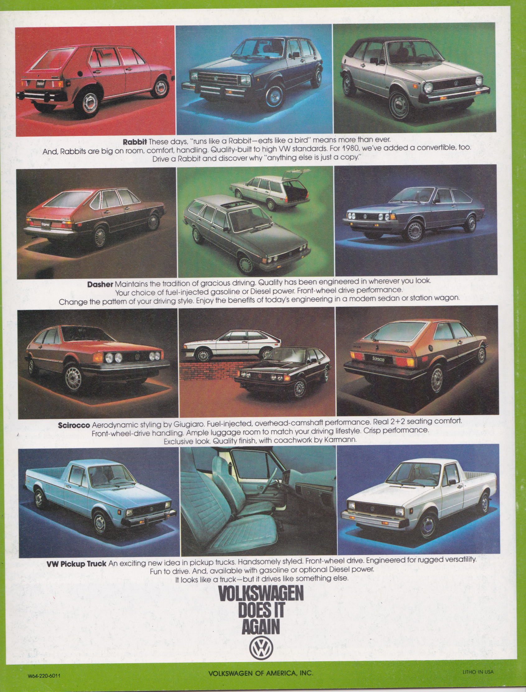
One odd twist on all of this is that on pre-production versions of new Volkswagens like the 2020 Golf, the badge seen on the car, while simplified compared to current badges, seems to differ from the new VW logo we're seeing.
Here, take a look:
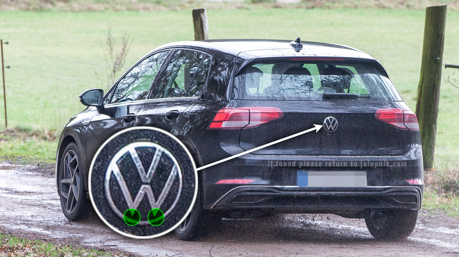
See that? the logo's lines are thinner, and, even stranger, the bottom points of the "W" don't merge with the exterior circle of the logo, something VW logos have pretty much always done.
Is this just a placeholder, or is this the actual new VW badge? If so why does it differ so from the new logo we've already seen?
I guess we'll find out next month in Frankfurt. Personally, I think it's weird without the W touching the circle—it looks like the letters are doing pull-ups or something.
