This Year's Automotive Color Trends Report Is Here And It's Pushing Brown Hard
I get that the phrase "pushing brown hard" can be taken very much the wrong way, but it's a good color
I'm not sure if you're aware of this, but every year the German chemical concern BASF — yes, the same BASF that you just bought your last vat of Baxxodur® epoxy-curing agents from — puts out an Automotive Color Trends report. This year's report is interesting, as it gives some hints that we might finally break free from the tyranny of grayscale, and, significantly, has made a shade of brown the Key Color for the Americas. Also, it's full of some absolutely dizzying PR/psychobabble bullshit that's always fun to read.
Last year I actually reached out to Paul Czornij, BASF's North American lead designer, and asked him some hard questions, and I don't think I'd ask him anything different today, because the 2020 Color Popularity Report exhibits pretty much the same trends:
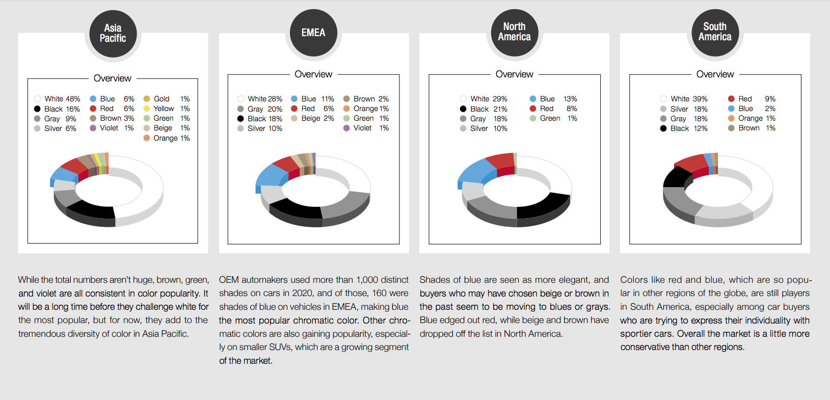
The dominance of boring-ass whites, grays, silvers, blacks and other non-colors continues unabated, even if carmakers try to dress them up with fancy names, like this bullshit from Polestar:
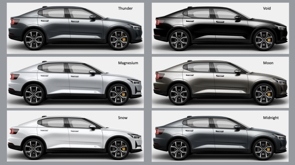
Thunder? Snow? Moon? Void? Come on. That's gray, black, light gray, gray, white, gray. Don't give me this Void and Magnesium bullshit.
Those charts also show that while the grays dominate, at least Asia and Europe include a decent smattering of other colors, but America looks to be the worst, with about 75 percent of colors being non-colors, and the remaining chunk being divided between blue, red, and a tiny sliver of green.
Pathetic.
Let's give BASF some credit in their 2021-2022 Color Trends Report, which is sort of like a proposed stylebook for the upcoming year of car color, for attempting to suggest a broader palette of colors. Here's their 2021-2022 collection of colors:
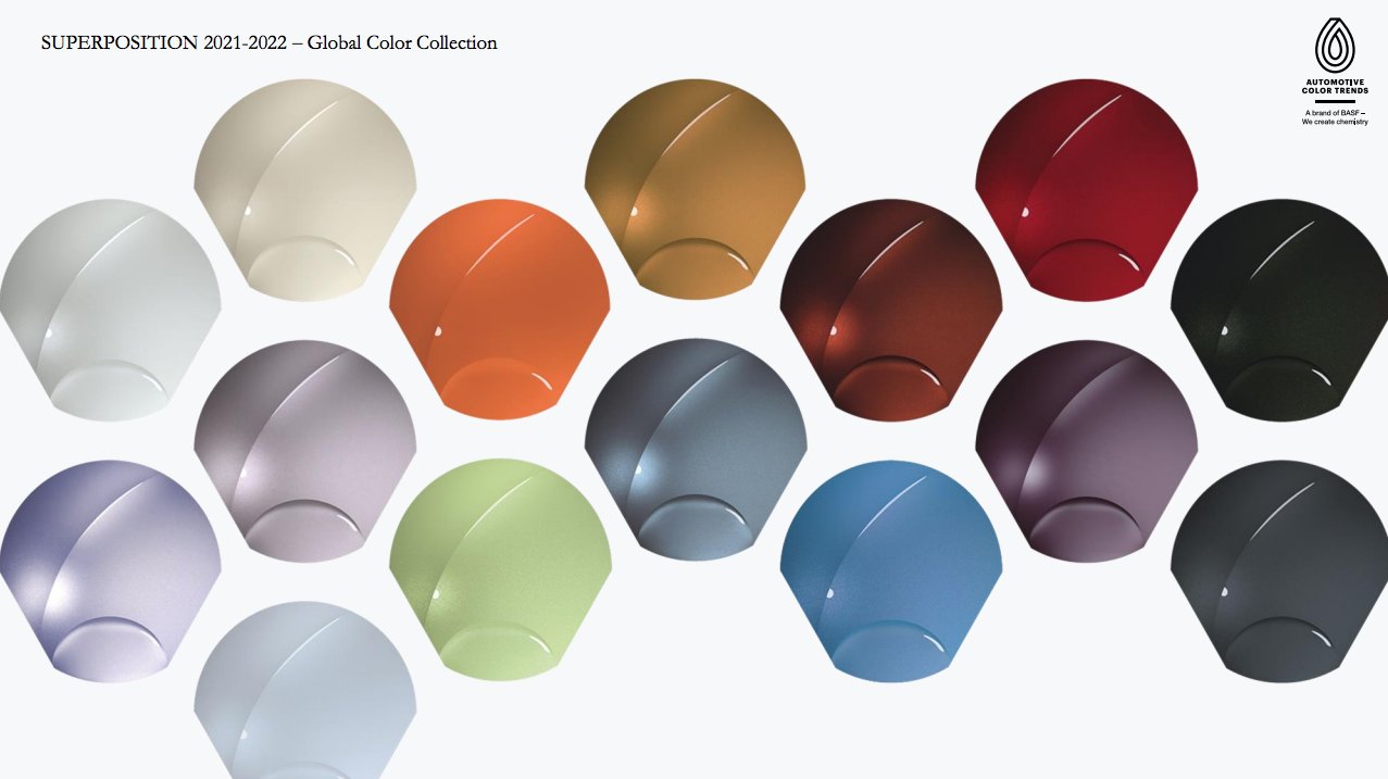
Okay, now we're talking! Those are some colors, all displayed on what look like what seashells would look like if they were designed by Audi or something.
BASF hired someone to come up with some ridiculous prose to back up their color choice, which is all based on the concept of superposition:
SUPERPOSITION 2021-2022 Think of a spinning coin to capture the idea: you can see heads and tails at the same time, along with everything in-between. Opposites can coexist without interference or disturbance. Opening up, they can be both at the same time for the moment of SUPERPOSITION.
So, yeah, that means precisely nothing. You can think of it as the superposition of both bullshit and horseshit, encapsulating both concepts at once, somehow.
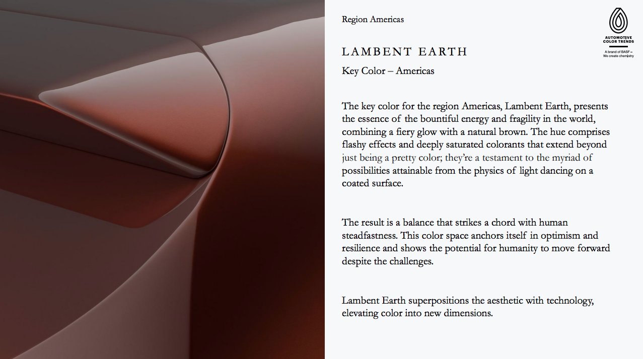
Still, I generally like those colors, and I'm especially excited about the Key Color for the Americas, because it's a shade of brown, a longtime favorite of our particular automotive Jalop community. They call it, eye-rollingly, Lambent Earth:
And, of course, this earthy, browinsh hue is celebrated with exultations via another earthy, browinsh tradition, more bullshit:
T H E C O N C E P T O F B A L A N C E
In contrast to previous trend collections that explored extremes in texture or color, this year's theme looked to the concept of balance for the inspiration of the region Americas.
We found the equilibrium between the natural and the synthetic world to create calming, unwavering, and thought-provoking colors. They draw the viewer into unique sensations that operate on multiple non-binary levels.
The result is collection of colors generated with pigments and effects that give the sensation of being anchored to a timeless color space yet stay fresh and unconventional.
Some have a flashy glint overlaying a subdued pastel. Some emerge from darker voids. Some have hyperfine flakes evoking softness. All beckon one to discover something new about oneself.
Absurd copy aside, this is a nice brown! I'd love to see more new cars in this rich, luxuriant earthtone. Carmakers, listen to BASF!
Their Key Colors for other regions have equally baffling names. Check out Asia's picks:
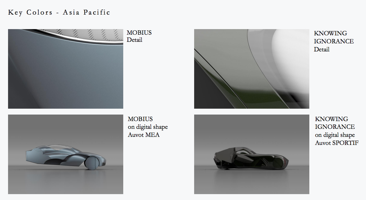
Knowing Ignorance? Wow. South America's Key Color is Amicable Glimmer, which sounds like what an AI thinks a line of makeup should be called.
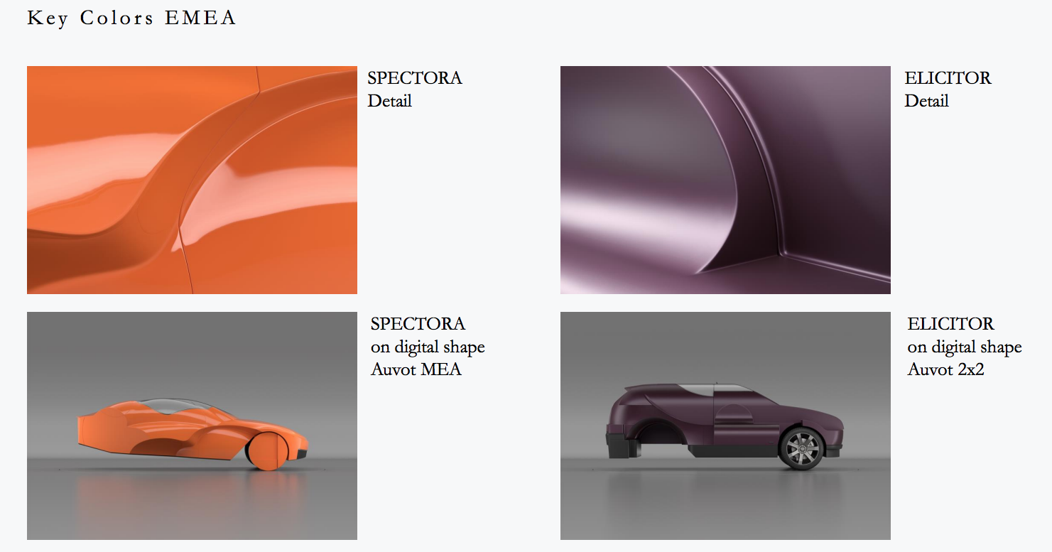
Europe gets a fun orange and purple as key colors, named for what sound like enemy wizards in some young adult fantasy book series, Spectora and Elicitor.
I really love these reports because it's one of the few places a Very Serious company like BASF, known for making industrial chemicals that come in massive drums, can really let go and let their freak flag fly, both in the academe-delirious copy and the frankly sometimes unsettling art.
Here, look at the images used to showcase the Euro region colors:
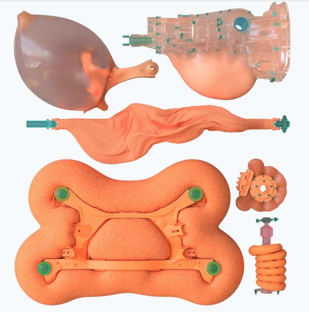
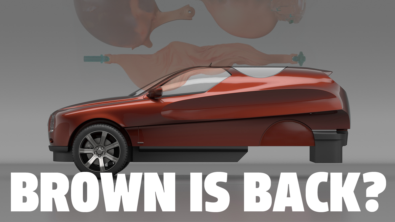
Holy crap, what the hell are we looking at here? These strange, partly biomorphic, partly technological forms remind me of, say, Kiki Smith's powerful and disturbing body-based artworks, and yet here they are, in a report from a massive chemical conglomerate.
Is that a baggy-skinned, scrotum-like driveshaft up there? Is that a brake caliper that was grown in a vat, made of bone and fat and skin? Does that transmission have a goiter?
These are deeply unsettling images, and I salute BASF for putting them out into the world.