The 15 Best NASCAR Cup Series 2022 Paint Schemes So Far, Ranked
What's your favorite paint scheme for 2022? Fight me in the comments
The NASCAR Cup Series is arguably America's premier level of motorsport — and it's also the sport that brought us some of the most iconic paint schemes of all time. From Jeff Gordon's Rainbow Warrior schemes to Dale Earnhardt's iconic Goodwrench sponsorship, there have been some cars that just look great. Today, I want to talk to you about the cars from the current 2022 season.
NASCAR differs from many European race series in one big way: The paint schemes and liveries frequently change from one race to the next. So, while some teams may run the same (or similar) schemes every weekend, many others change them out based on the sponsor of the weekend.
This year, paint schemes have become especially important thanks to the introduction of the new Next-Gen cars and the regulation that moved the side panel number from the center of the door toward the front tires. How teams have filled that space has varied from one race to the next — and the paint schemes below are the ones that took the cake.
15. JTG Daugherty Racing No. 47 Sunny D — Las Vegas
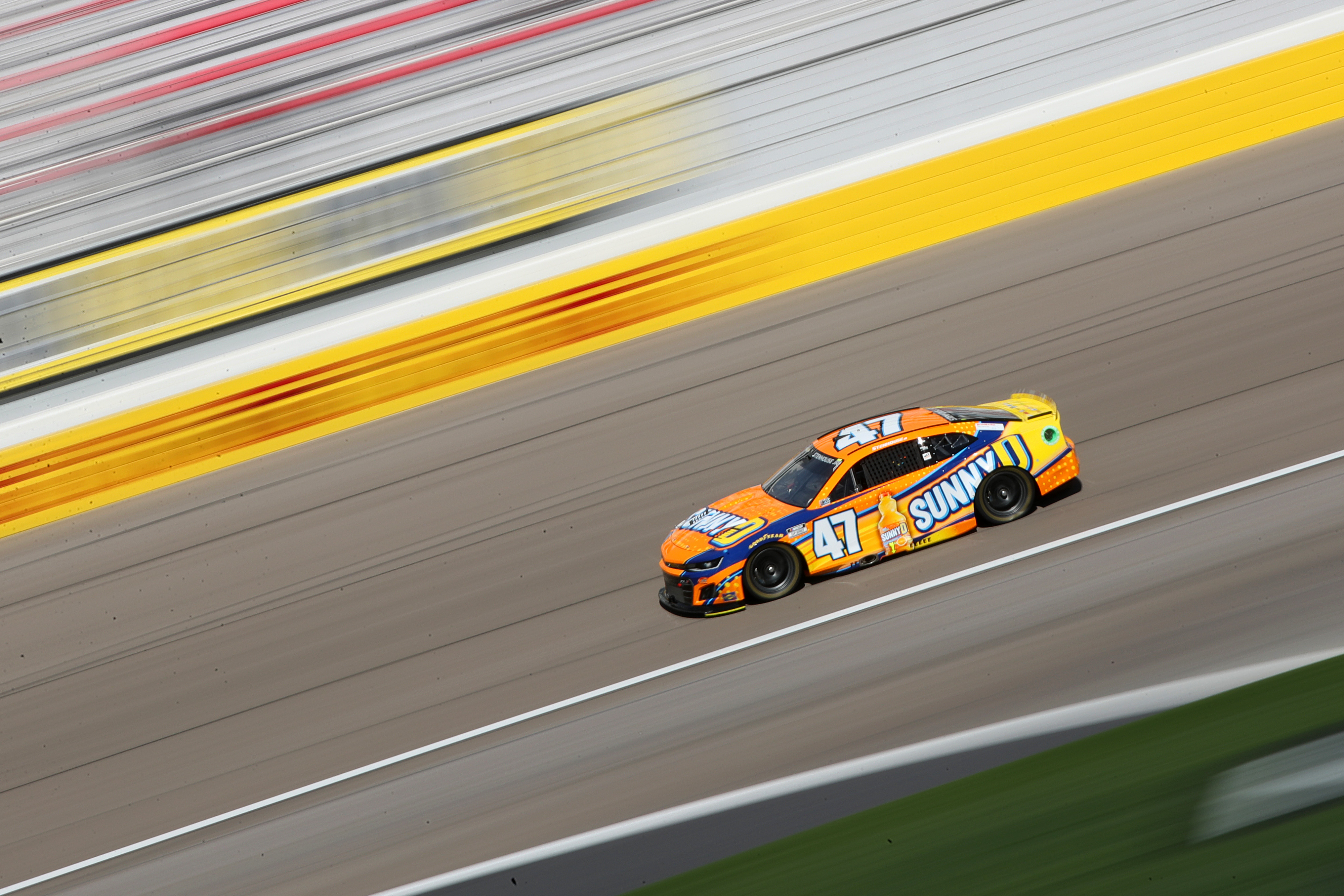
JTG Daughtery has had some exceptional schemes this year, and I had a tough time narrowing the selection down to this sole Sunny D car driven by Ricky Stenhouse Jr. at Las Vegas. Orange/yellow and blue is an immediate win — the two complementary colors catch your eye and help hold your attention. But the big thing about the Sunny D livery is the fact that it's both clean and fluid. You're not bogged down by a ton of different colors or jarring right angles. Your eye just moves from one end of the car to the next with ease.
14. Hendrick Motorsports No. 48 Ally — Fontana
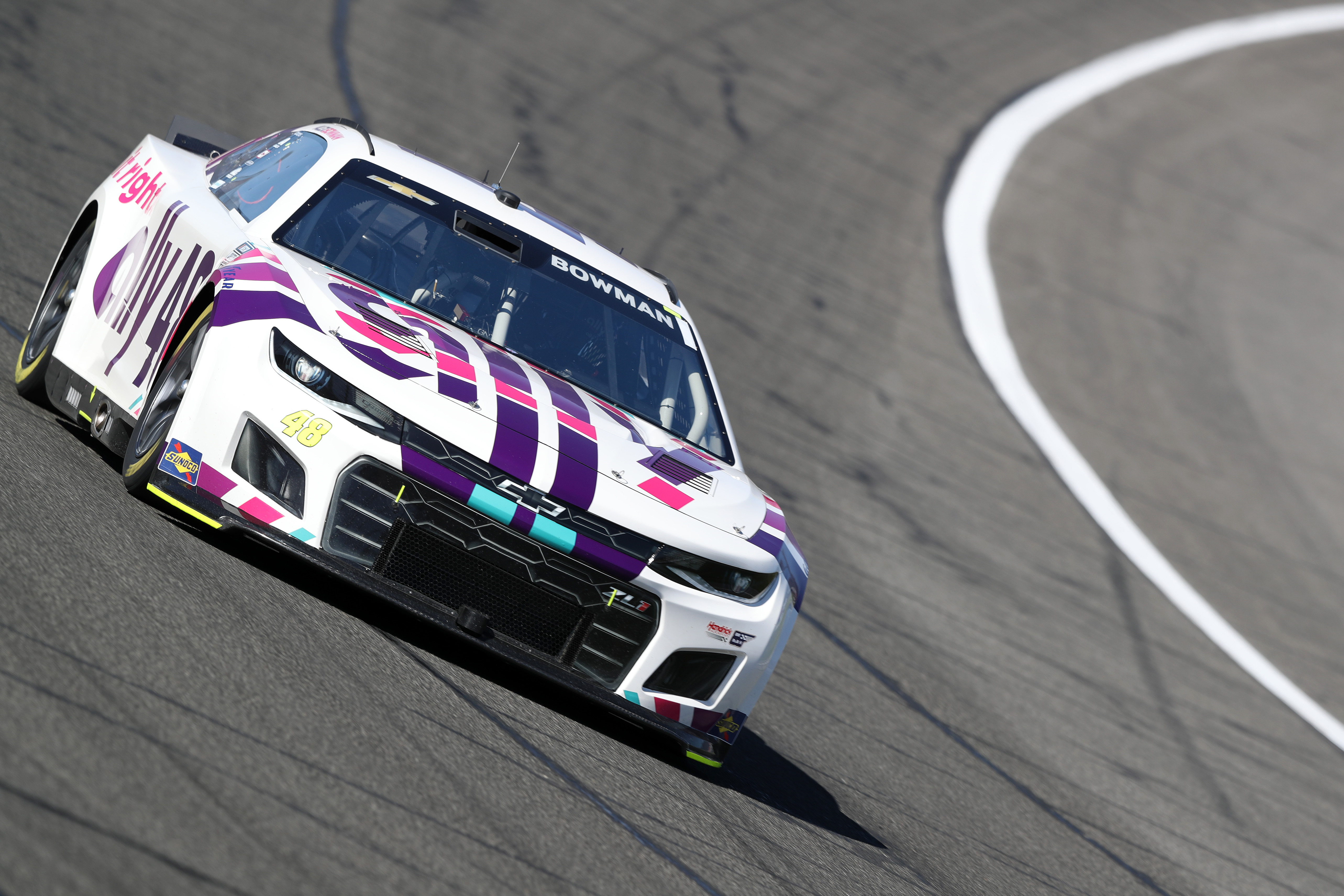
I don't think it would be presumptuous to say that there's never actually been a bad Ally livery, but Alex Bowman's scheme for Fontana was incredible. I've enjoyed the echoed "Ally" lettering on the hood of the car, the clean rear quarter panels, and the colors, generally. Too many teams opt for dark colors in their paint schemes. Ally and Hendrick consistently show that you can go a different way.
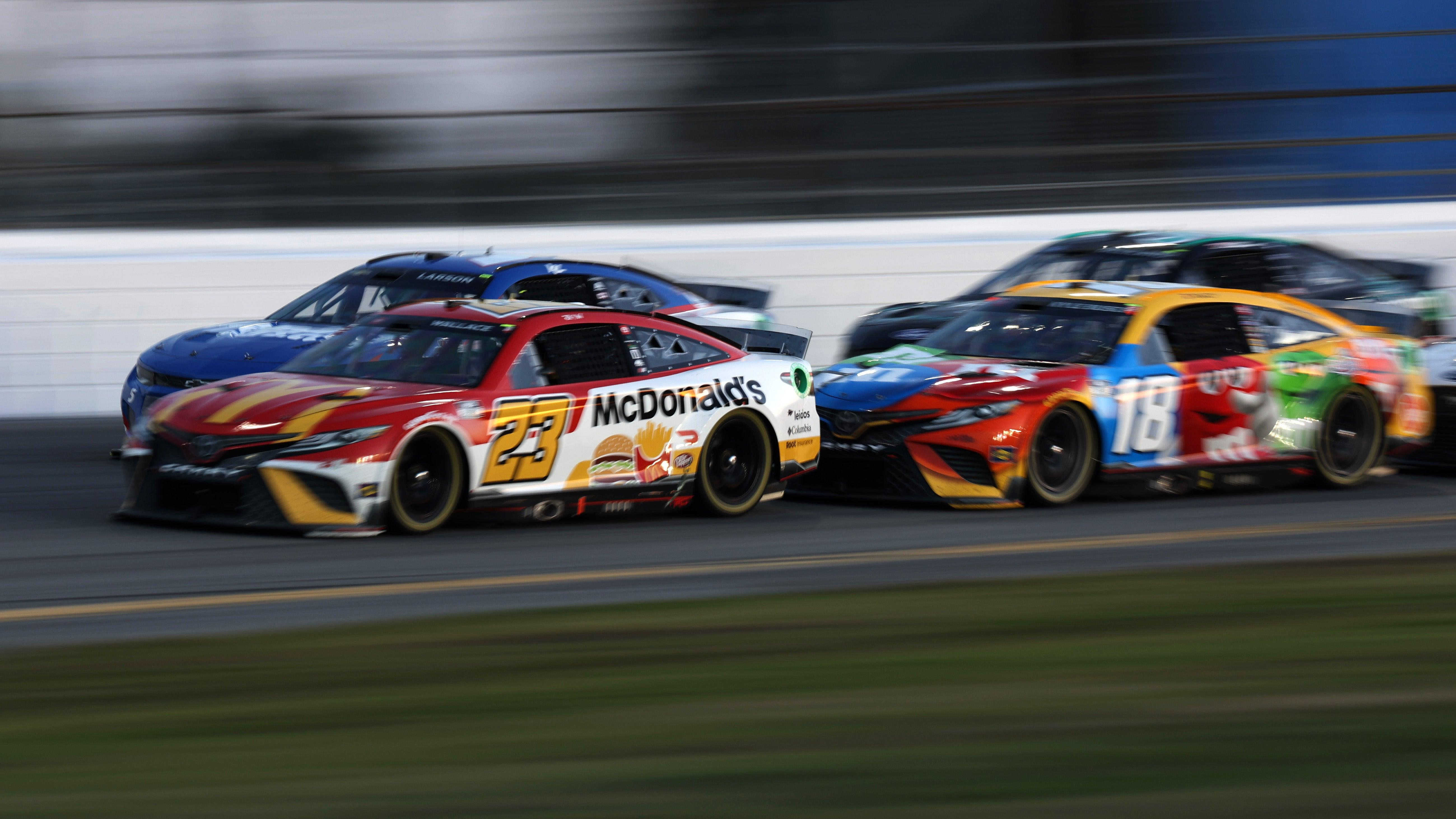
13. 23XI Racing No. 23 McDonald’s — Daytona 500
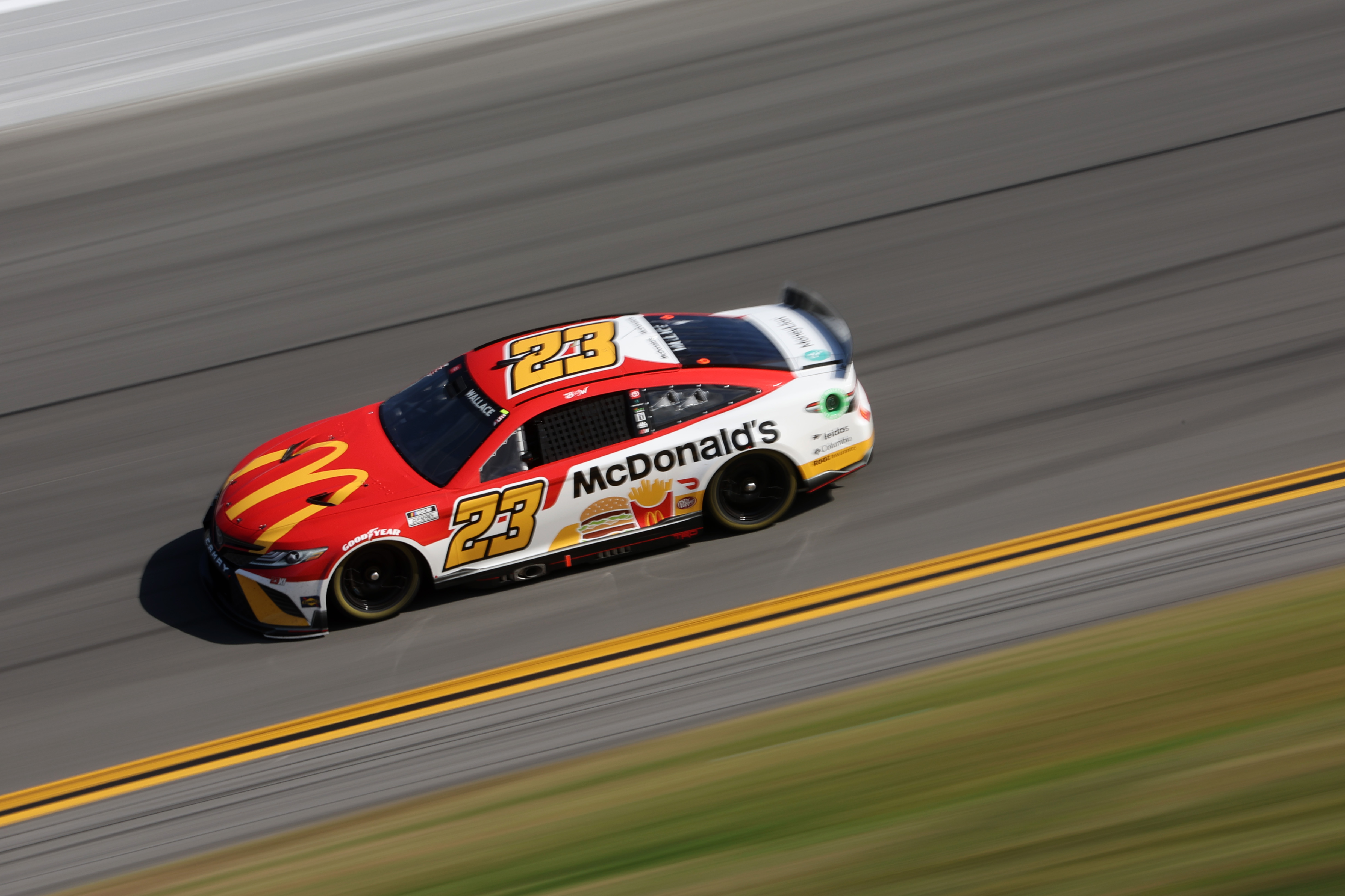
23XI is another team whose paint schemes have been on point, but the McDonald's layout from the Daytona 500 has been the best of the year. While I do dock a few points for the positioning of the McDonald's "M" (it looks too low on the hood), the simple colors and the adorable drawings of the burgers and fries on the side easily make up for any other flaws.
I want to give a special shoutout to the Dr. Pepper Cream Soda livery, too. It very nearly made my list but had to be cut in favor of schemes I liked just a little bit more.
12. Stewart Haas Racing No. 4 Subway — Fontana
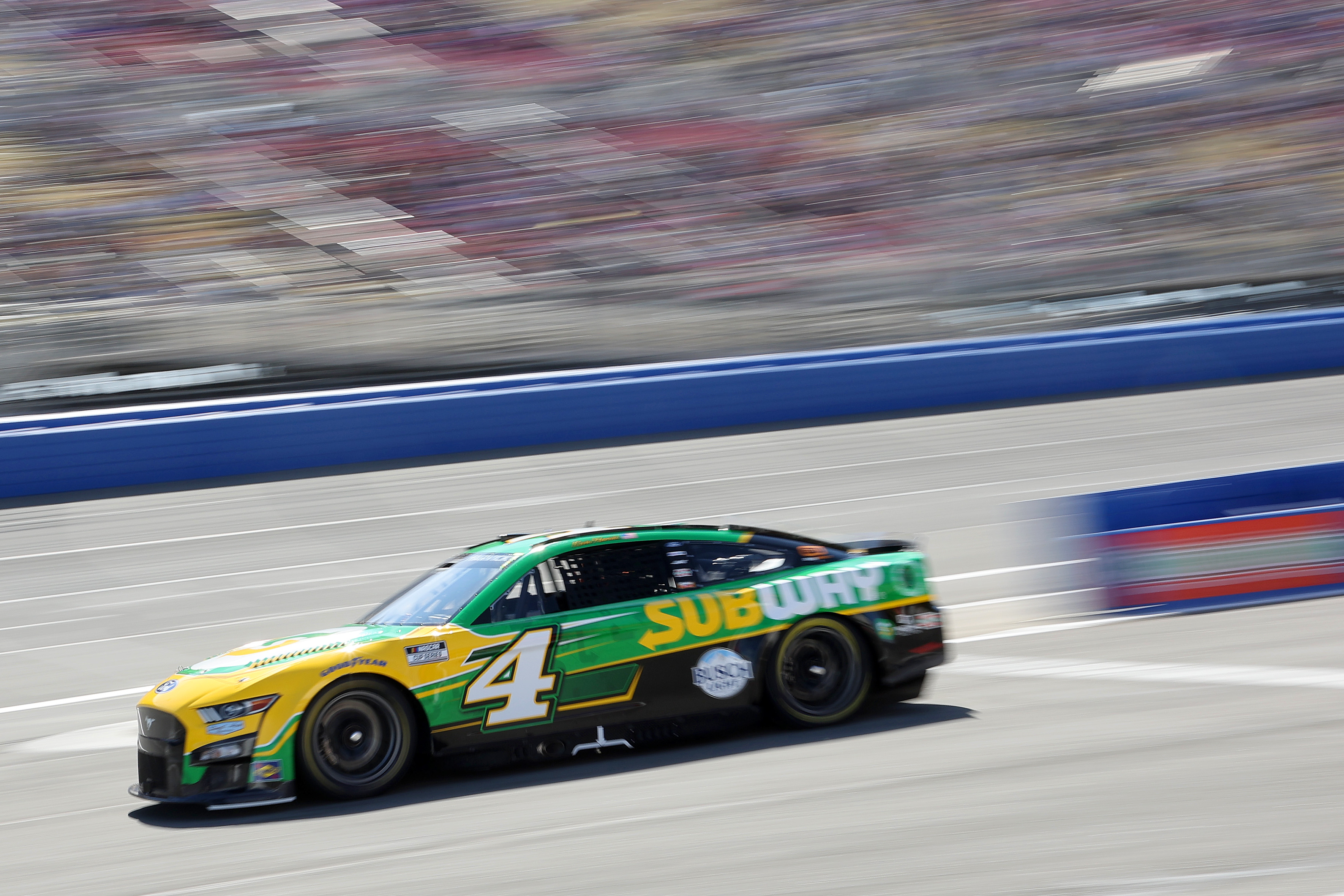
While Kevin Harvick predominately drives the No. 4 outfitted in a Busch paint scheme, this Subway transition was a damn good one. The company's green, white, and yellow branding is put to great use with some very sharp contouring and the addition of a well-placed, contrasting outline. It's the kind of paint scheme that might actually make me consider consuming "food" at Subway.
11. Team Hezeberg No. 27 Woodie’s Wash Shack — Daytona 500
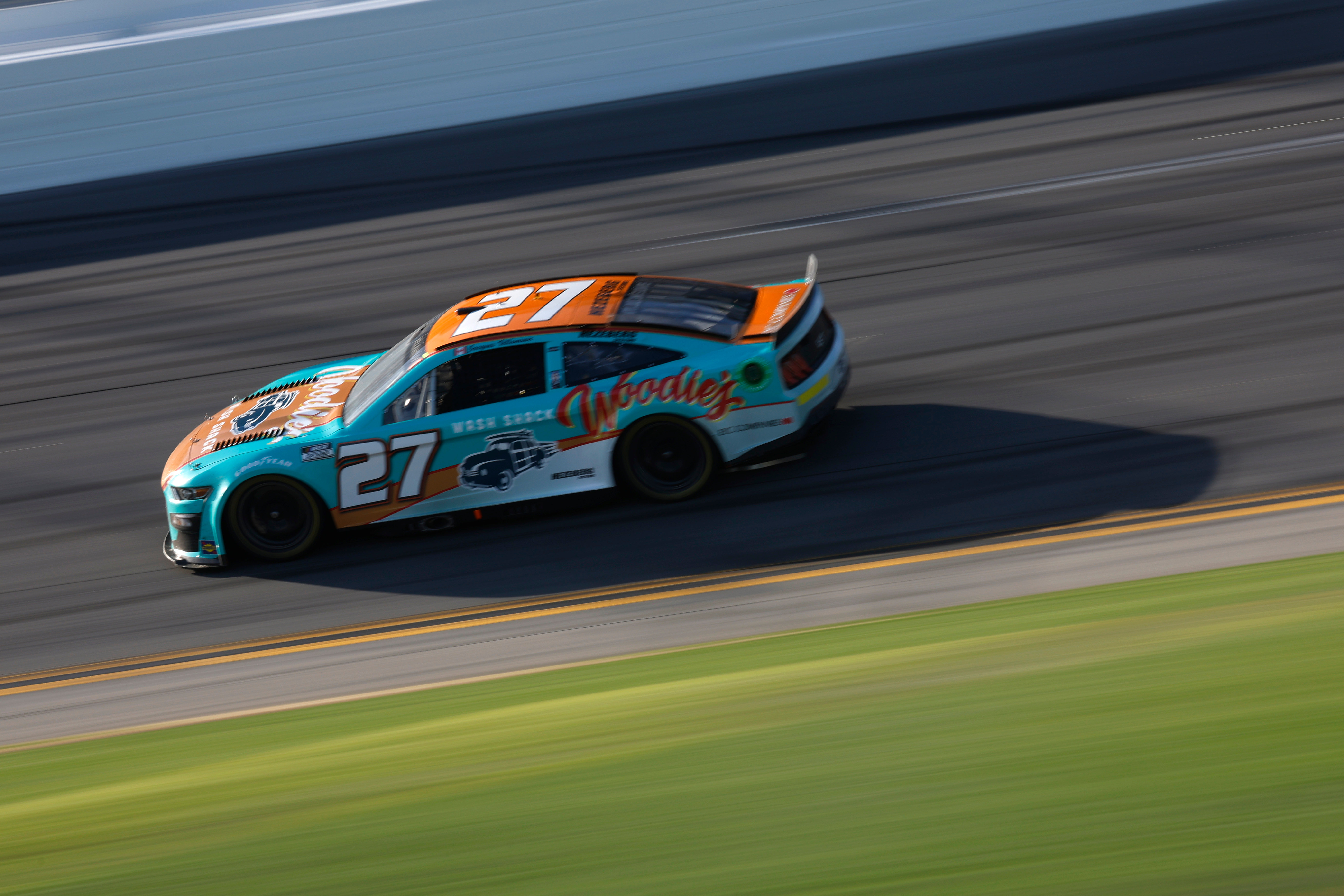
Now, I'm no Jacques Villeneuve fan — my Canadian husband be damned — but the Woodie's Wash Shack paint scheme was one of the books. Another example of the complementary colors put to great use, the retro feel of the No. 27 did win my heart at the Daytona 500. The light blue really did a lot to give off those beach-friendly vibes.
10. Hendrick Motorsports No. 24 Axalta Scheme — Phoenix
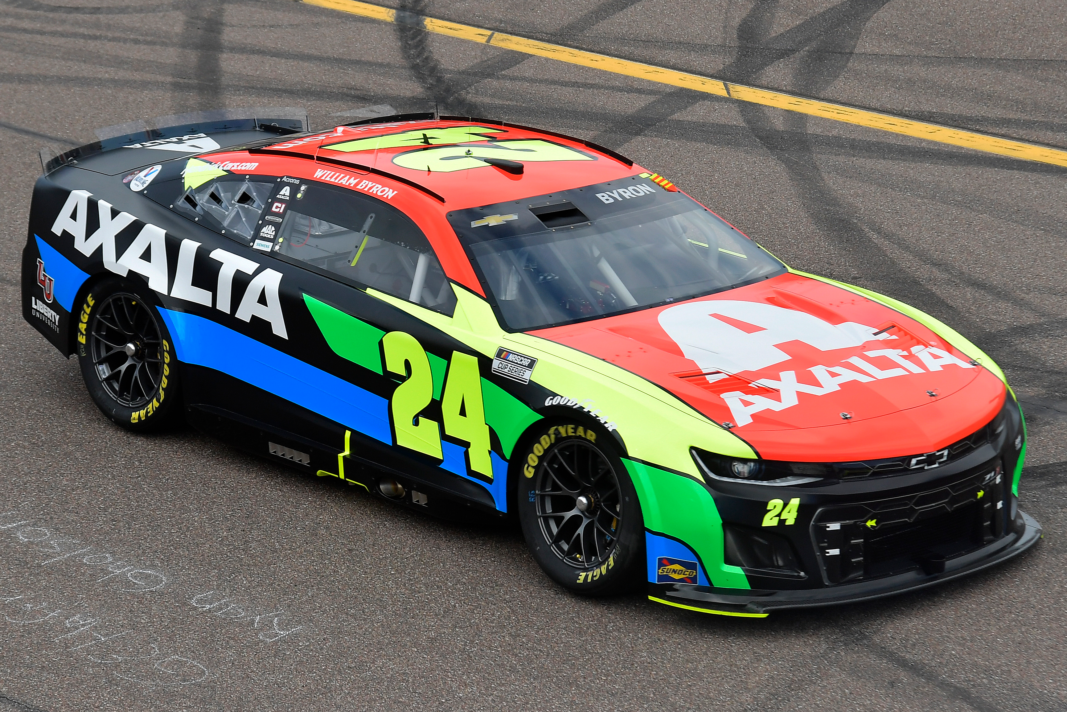
I appreciate Hendrick Motorsports' commitment to retaining the base colors from Jeff Gordon's iconic No. 24 while still finding ways to keep things fresh. This Axalta scheme is a great example: The bright blocks of primary colors (and green) work in perfect contrast to the black body and white lettering, and it's all emphasized by the matte paint. Very well done.
9. Joe Gibbs Racing No. 18 Ethel M Chocolates Scheme — Las Vegas
Choosing Kyle Busch's Ethel M paint scheme over any of his M&Ms paint schemes is probably controversial bordering on heresy where some fans are concerned, but I don't care. Brown and that pale turquoise work great together, and (as you'll continue to see) I have a soft spot for pastel cars.
8. Hendrick Motorsports No. 5 Valvoline Scheme — Phoenix
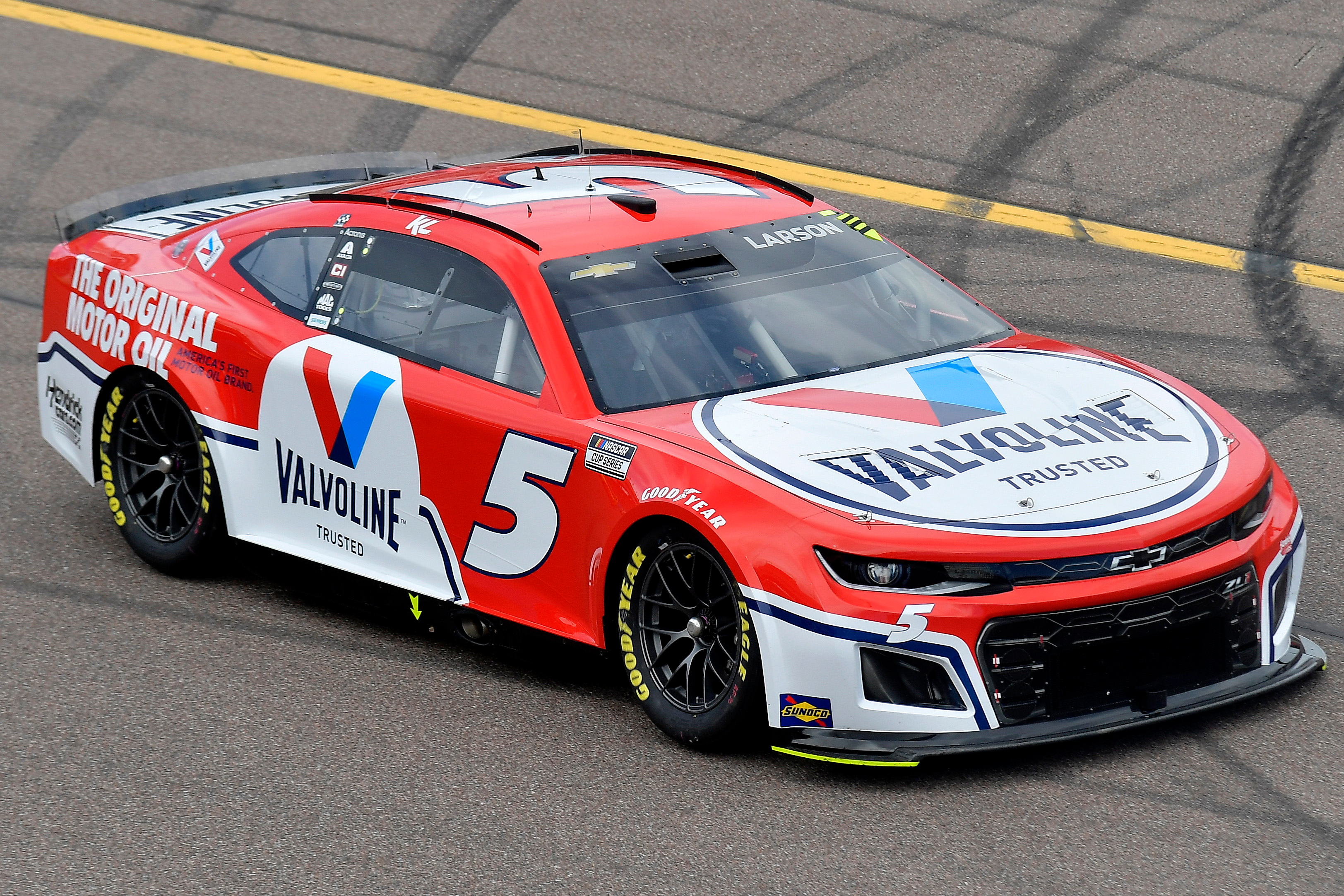
The longtime Mark Martin fan in me generally dictates that I must enjoy a Valvoline paint scheme, but I have to admit that Hendrick's No. 5 scheme at Phoenix was on a whole new level. I love that the team prioritized red instead of blue and also cut back on the traditional Valvoline scheme angles in favor of some curves. I hope we see more of this one.
7. Roush Fenway Keselowski Racing No. 6 Violet Defense — Busch Clash
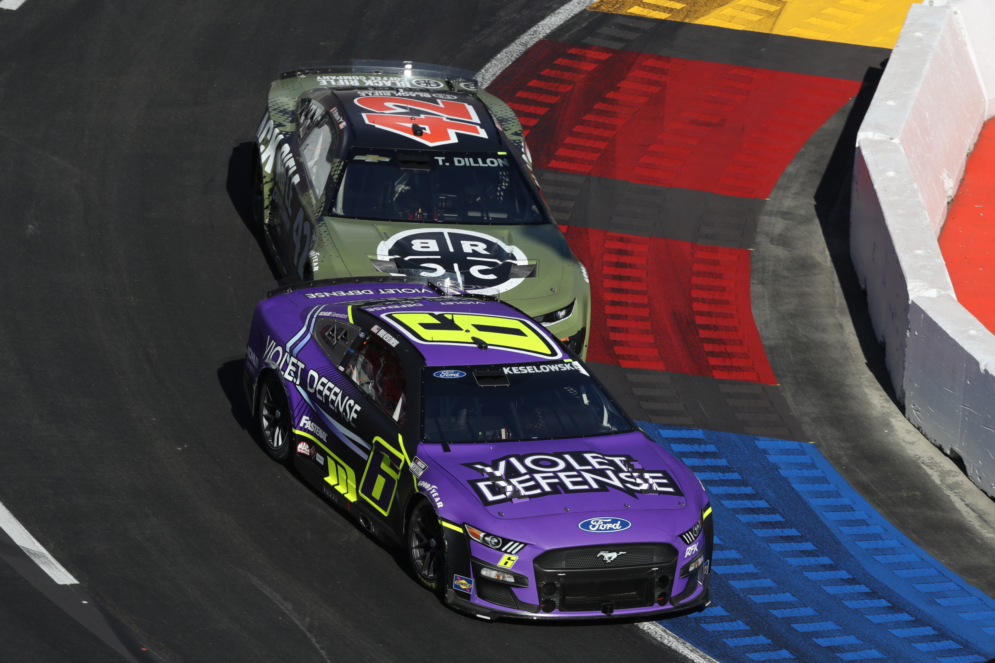
I don't know what Violet Defense is (I kinda hope it's the angrier version of the lavender menace), but the No. 6 RFK machine looked damn good with the neon yellow and purple scheme. The sharp, eye-catching yellow is very angular while the other details are lighter and softer, but somehow, it all works.
6. Wood Brothers Racing No. 21 Dex Imaging — Daytona 500
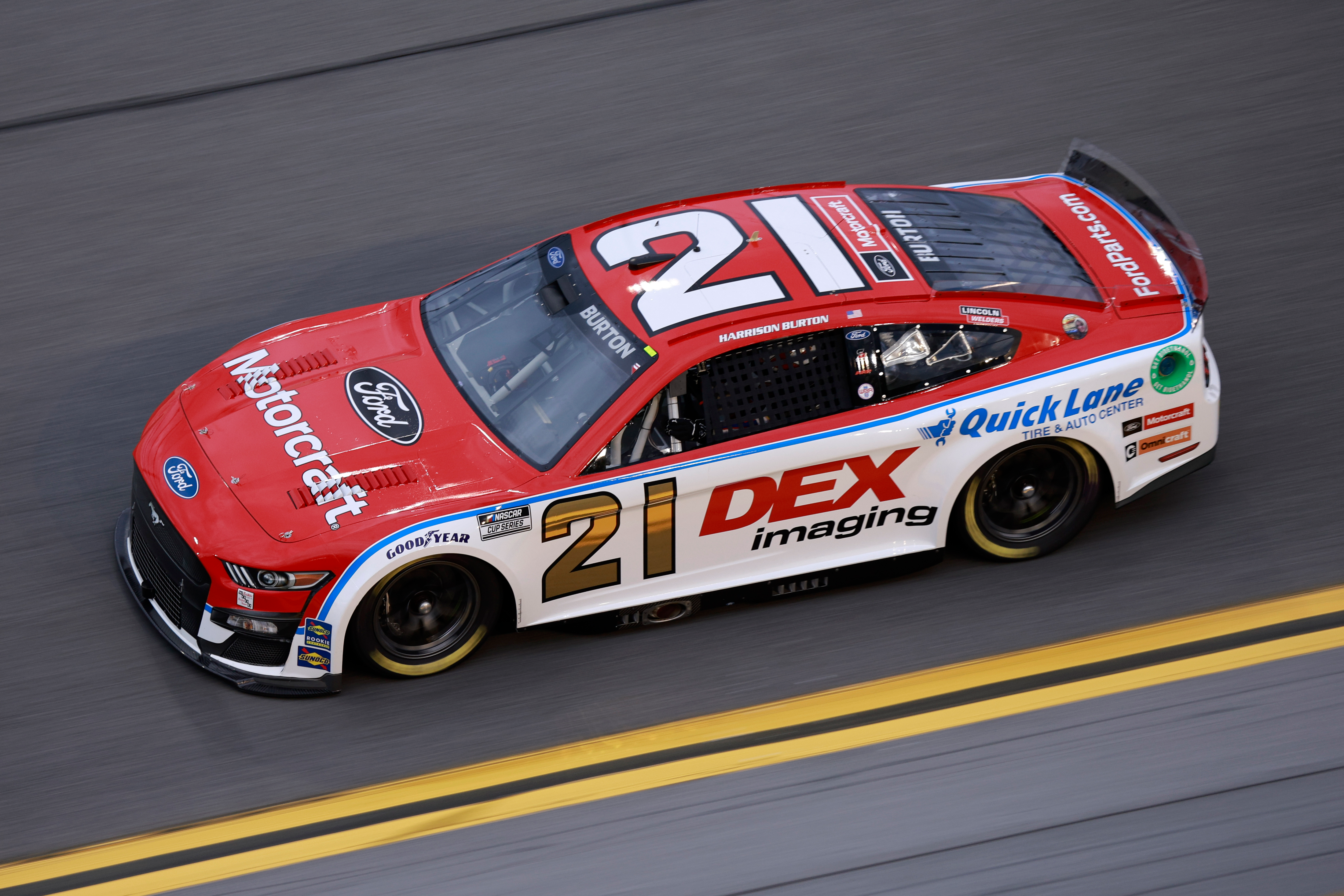
Wood Brothers Racing knows it need not mess with a good thing, and its classic red, white, and blue livery once again reigns supreme — especially now that NASCAR has allowed the use of metallic paint for door numbers, which means we have a return of the gold No. 21. Now, if everyone can please stop crashing into Harrison Burton, I would be extremely grateful.
5. NY Racing No. 44 Stillman College Scheme — Atlanta Motor Speedway
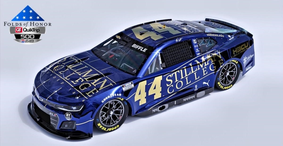
NY Racing team is one of the few Black-owned teams on the NASCAR grid owned, and though it is a smaller outfit, its upcoming Stillman College scheme slaps. I tend to forget how well navy blue and gold work together until I see it used and immediately proceed to fawn over it — but this paint scheme is especially great because the thin strips down the length of the car really emphasize the Chevy's angles. It looks cut.
4. Rick Ware Racing No. 51 Nurtec ODT — Las Vegas
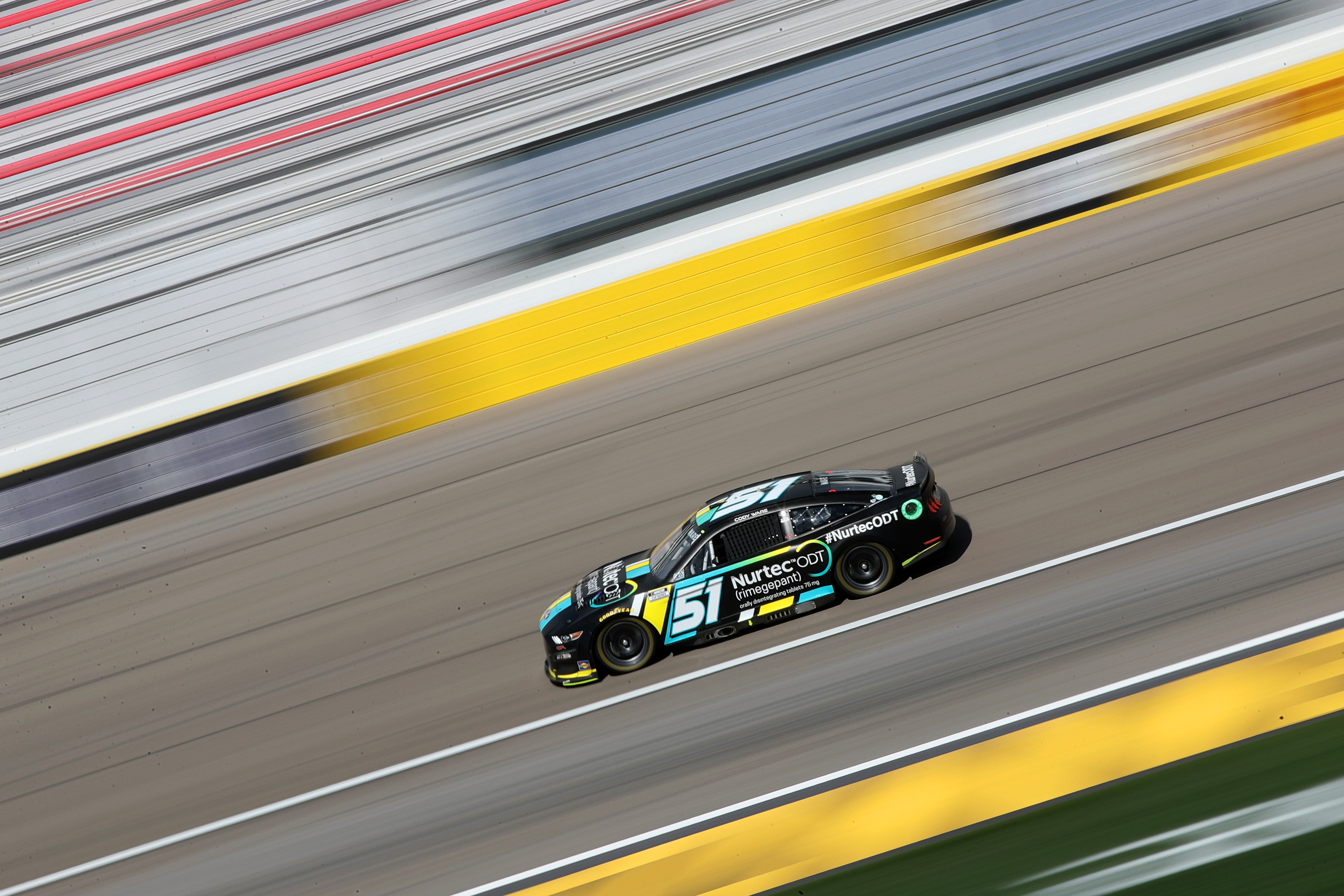
As a longtime believer that racing needs more purple, I'm a big fan of the regular Nurtec scheme — but I had to give my accolades to Cody Ware's No. 51 at Las Vegas. What could have been a boring black car is punctuated with thick, bright racing stripes. It's fairly simple, but it works. Though that may just be because I'm a sucker for beefy racing stripes in general.
3. Trackhouse Racing No. 99 Tootsie’s Scheme — Daytona 500
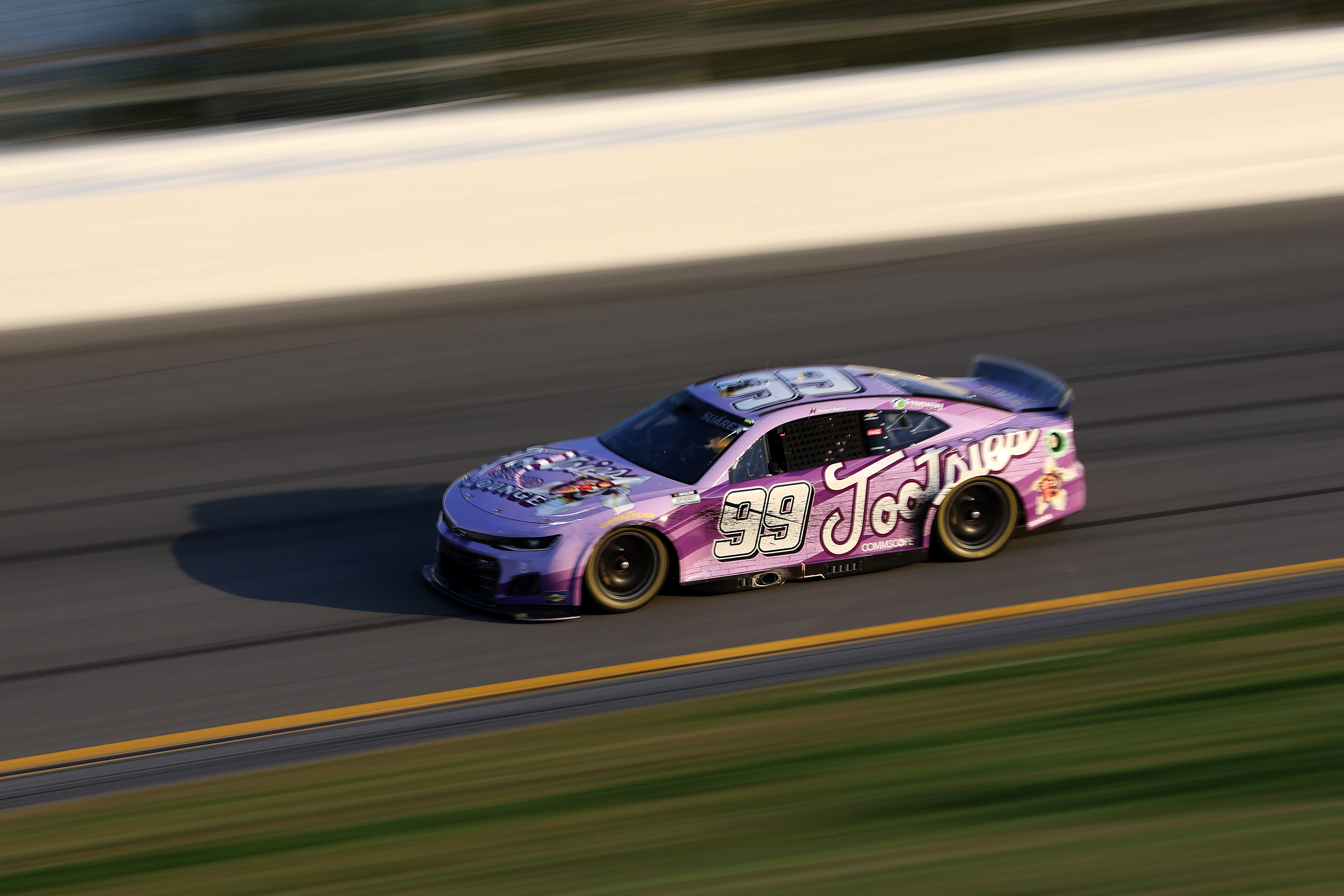
Another purple powerhouse, the No. 99 Trackhouse Racing Tootsie's scheme is amazing. It's fucking cute. It's like if Justice For Girls circa 2003 vomited onto a NASCAR machine, and I adore it.
2. Richard Childress Racing No. 3 Get Bioethanol — Phoenix
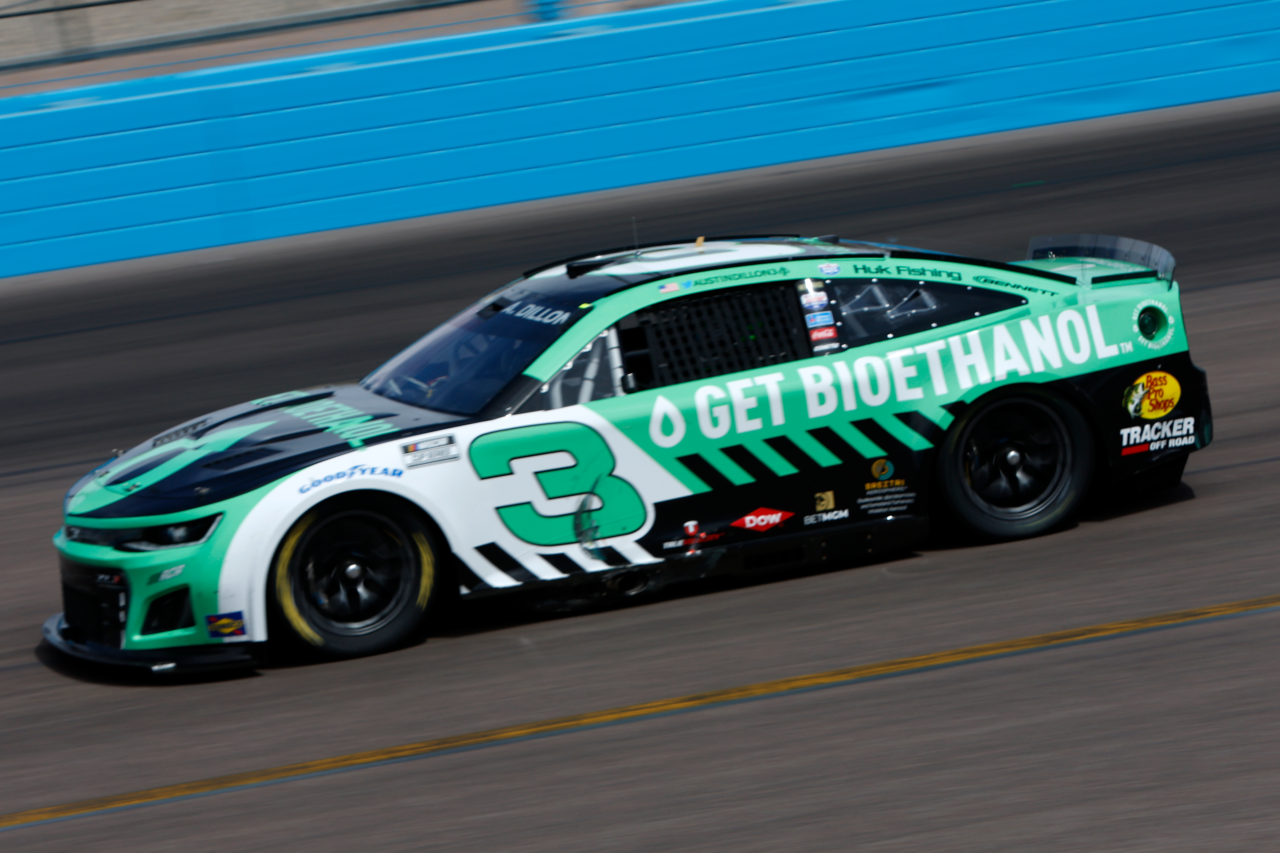
Perhaps I am naught more than a basic bitch, but black, white, and teal will always warm the cockles of my cold, dead heart. This paint scheme itself is fairly plain, but I think it makes good use of the natural lines of the car and the angle of the No. 3.
1. Trackhouse Racing No. 1 Howler Head Bourbon Scheme — Busch Light Clash
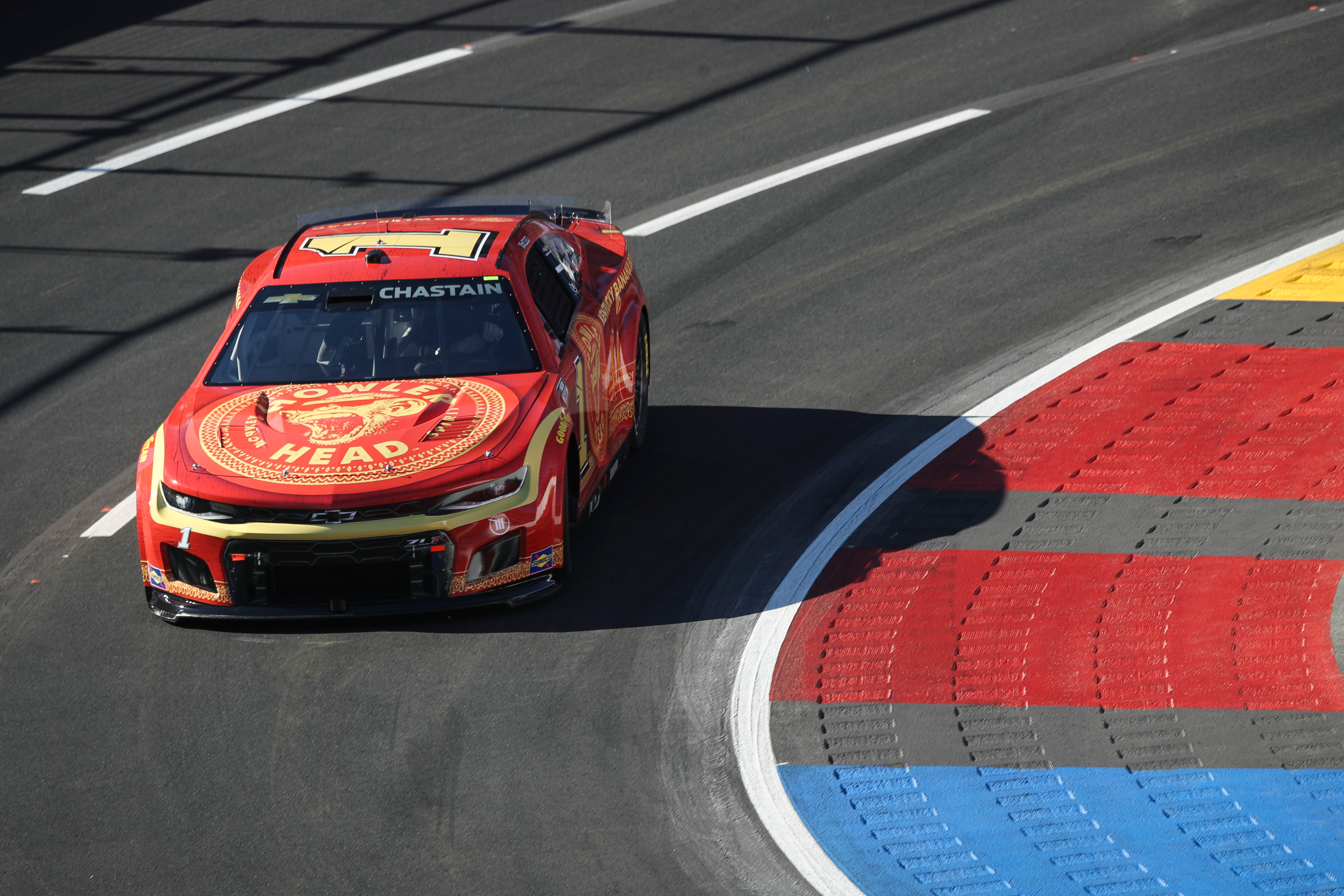
I hate to be one of those people who buys a product only after having seen it on a race car, but Howler Head Bourbon will forever be one of those purchases I'll swear by. It has a faint banana flavor that makes for an excellent cocktail mixer — and its paint scheme on the No. 1 Trackhouse Racing machine at the Busch Light Clash was damn good, too. It can be hard to develop a red-and-yellow layout that doesn't automatically make people think of McDonald's, but Howler Head and Trackhouse figured it out — and for that, it takes the top slot.