New Tesla Gear Shift Interface Disrupts Shifting Gears In A Bold New Way No One Wants
Tesla's user experience team seems to really have it in for the traditional way cars are put into gear. Or, really, it's not even technically putting the car into "gear" anymore, as much as just selecting a direction of travel, forward or reverse. The traditional ways of automatic transmission shifting into drive or reverse, via levers, floor-mounted shifters, or even buttons, appear to be distasteful to Tesla UX folks, who have already been working on ways for the car to "guess" the desired gear, and now we've got our first glimpse at the touchscreen-based shifting. It's, uh, not great.
I shouldn't speak for you, though. Here, you can decide for yourself:
New gear shifting in the s/x refresh pic.twitter.com/0Me0WvSv4Y
— Tesla Owners Silicon Valley (@teslaownersSV) March 24, 2021
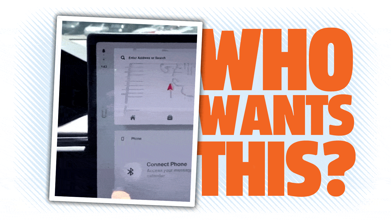
Okay, so instead of a shift lever or stalk or buttons or whatever, we've got a tiny, fingertip-sized drawing of the overhead view of a car, and when you touch the car with your finger, tiny arrows appear above and below the car, which you then drag either up or down, for forward or reverse.
Then, once selected, the little car snaps back to its original position.
Okay, at the risk of the Children of Elon getting all pissy with me all over the internet, I'm going to go out on a limb and say this gear shifting method sucks, pretty comprehensively.
The control itself is tiny, unlabeled, and very unintuitive, at least at first glance. If you just sat in this car and didn't already know how to shift it, how much looking around would you have to do before you discovered how the hell to get the car in gear?
All that's on the screen there is a little car, crammed over by the edge of the big display. I suppose after a while you might tap on it, in desperation, the pack of wild dogs already scratching at the doors (I should have mentioned in this scenario, you're being chased by a pack of wild dogs) and even then if you saw those two arrows, I bet a not-insignificant number of people would tap on the forward or reverse arrow before dragging the little car one way or another.
That drag motion takes more time and attention than just poking a forward or reverse arrow, too. What's the point of that? It just makes it slower and harder to do. Plus, it's so small, it looks like it'd be very easy to miss the little car—hell, I miss slider widgets on my phone all the time.
Plus, I don't see any visual indicator of what gear you're actually in here, either, which would be handy—it should at least show you a D or and R, right? Why should you have to guess what gear the car is in? That's a potentially dangerous oversight, as it could lead to someone accidentally backing up when the intent to go forward, or the opposite.
Also, how do you select neutral? Or park?
There's also the issue of putting a basic, crucial car-driving control on a complex system like a computer-controlled touchscreen, which introduces the possibility of a failure in that system, software or hardware, leaving the car unable to be driven.
It's not like Tesla hasn't had issues with their center-stack displays before, for a number of reasons—what's the sense in tying a basic driving control to a complex subsystem like this if there's no need to?
In short, why? Why do any of this? The user experience is no better—it's arguably worse—it's more complex, there's far more potential points of failure, I really don't get it.
The only advantage I can see is perhaps this is cheaper to produce—it's all in software, and there's no physical controls for shifting, so that might save some pennies.
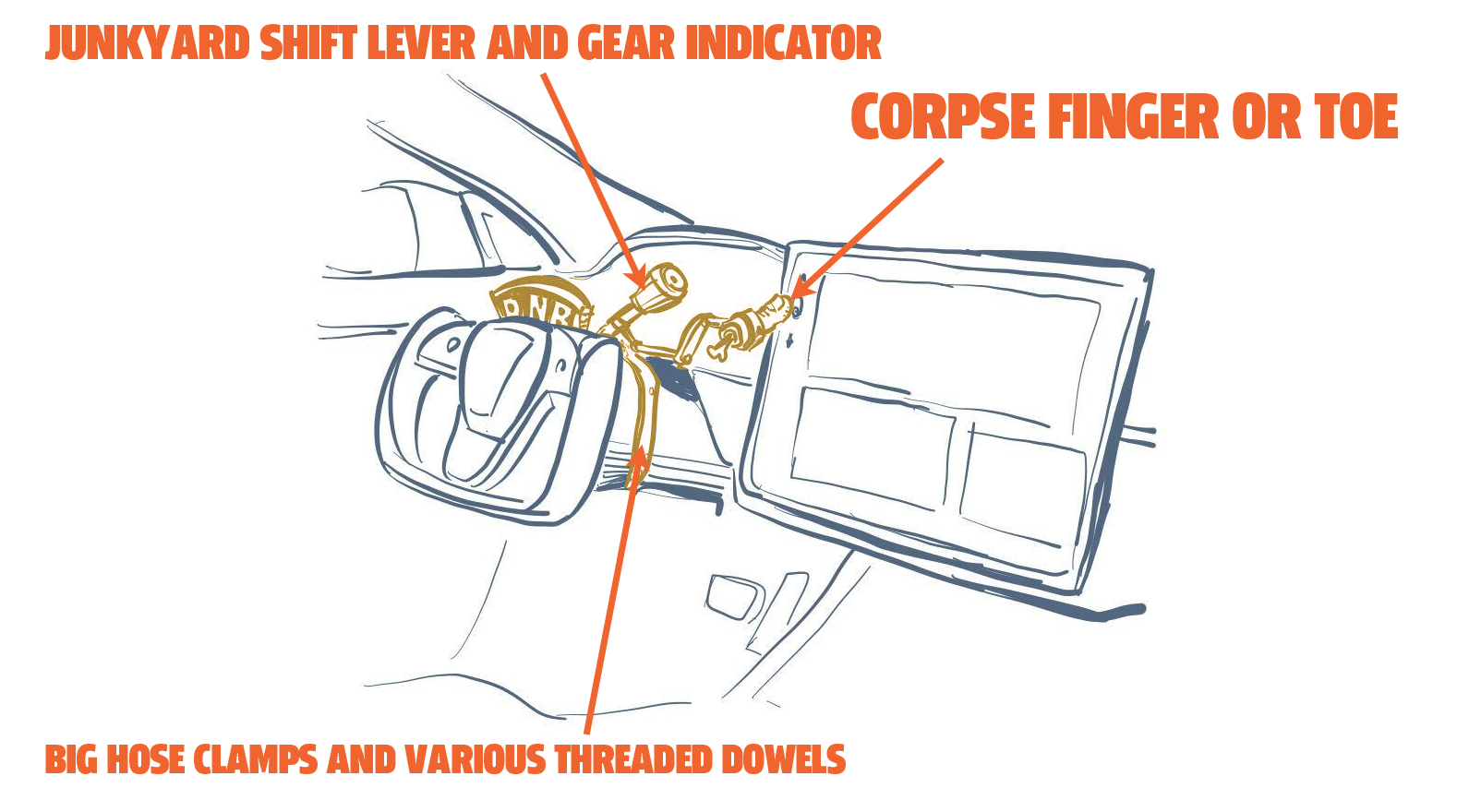
If anyone ends up with this system in their Tesla, and they realize they just can't get used to the crappy UX, I have a quick-and-dirty solution in mind that would be dirt cheap, and only cost a trip to the junkyard and maybe the morgue:

You might be able to replace the corpse finger/toe with a wad of ham or something, but I haven't tested this. It'll also probably take a bit of fussing to get the lever to pull the severed digit just the right amount, but I bet a clever reader like yourself could get it sorted in an afternoon.
This doesn't help the potential technical and reliability issues that come from integrating the shifter into a touchscreen, but it may help with the fussy UX design.
Anyway, let's all enjoy the Tesla Stans reminding everyone I'm a bedwetting moron on the payroll of Big Everyone But Tesla now!
UPDATE: Someone on Twitter showed us where Neutral is!
"Neutral" https://t.co/HjRHhbNxOt
— Liza Dixon ⚡️ (@lizadixon) March 24, 2021
I'm impressed. It's actually worse than I guessed.
