A NASCAR Team Joked About Making Its Numbers Huge And Fans Sorta Lost It
A gag for this weekend's All-Star Race in Texas got a little "out of hand"
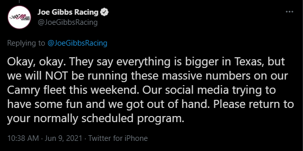
Stock cars and their big, stylized numbers are inseparable. Which is why when the numbers' size or placement is threatened with any change at all, fans kind of lose their shit. That's what happened Wednesday, thanks to a cheeky tweet from Joe Gibbs Racing ahead of this weekend's extremely confusing All-Star Race at Texas Motor Speedway.
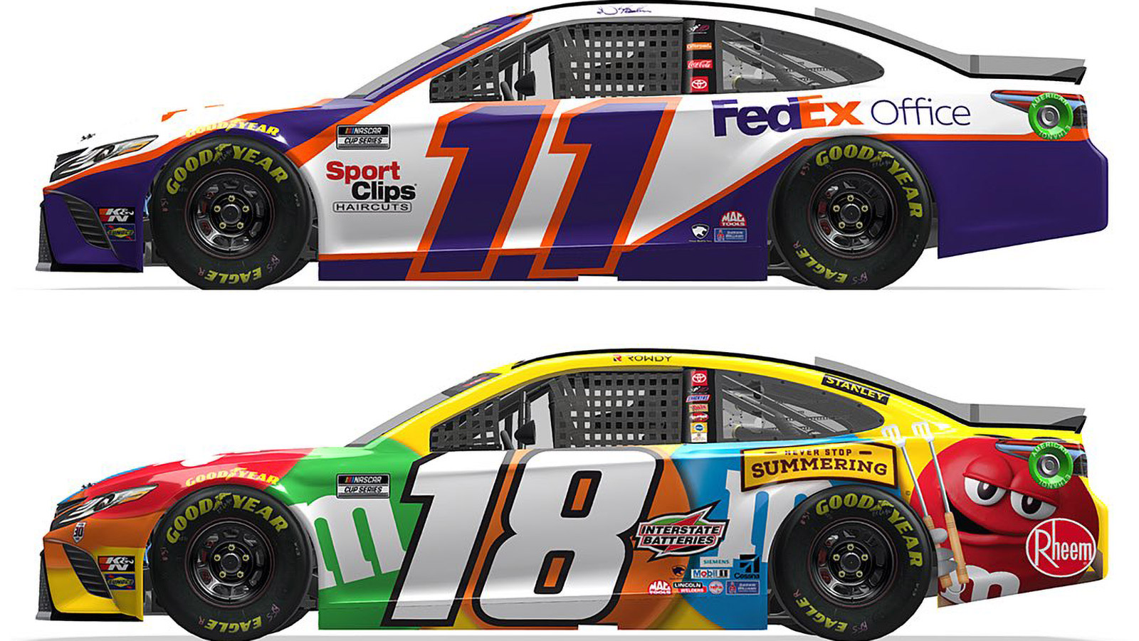
Now, I'm not a NASCAR fan (if you want to know why, the reason is down right there in my bio). But if I wasn't told that the numbers on these cars are larger than the ones NASCAR teams run now, I probably would not have noticed. OK, the #18 might have struck me as a little weird, but that has a lot to do with the fact it's sponsored by freakin' M&Ms — a troupe of anthropomorphic multicolored candied droppings that are always horny for some reason. Just look at that smug red asshole's face!
Everything's bigger in Texas. We decided to go big or go home for this weekend. pic.twitter.com/DSskx5ymUr
— Joe Gibbs Racing (@JoeGibbsRacing) June 9, 2021
Anyway, clearly my sentiments weren't those of the NASCAR community on Twitter. Some fans had intensely negative opinions, like one who called the liveries "an NR2003 creator's worst nightmare" (a reference to seminal sim racing title NASCAR Racing 2003 Season) while many others were far more welcoming of the idea. But just about everyone had something to say about it — which is why it felt a bit hollow when JGR turned around and revealed less than 40 minutes later that the whole thing was a gag.

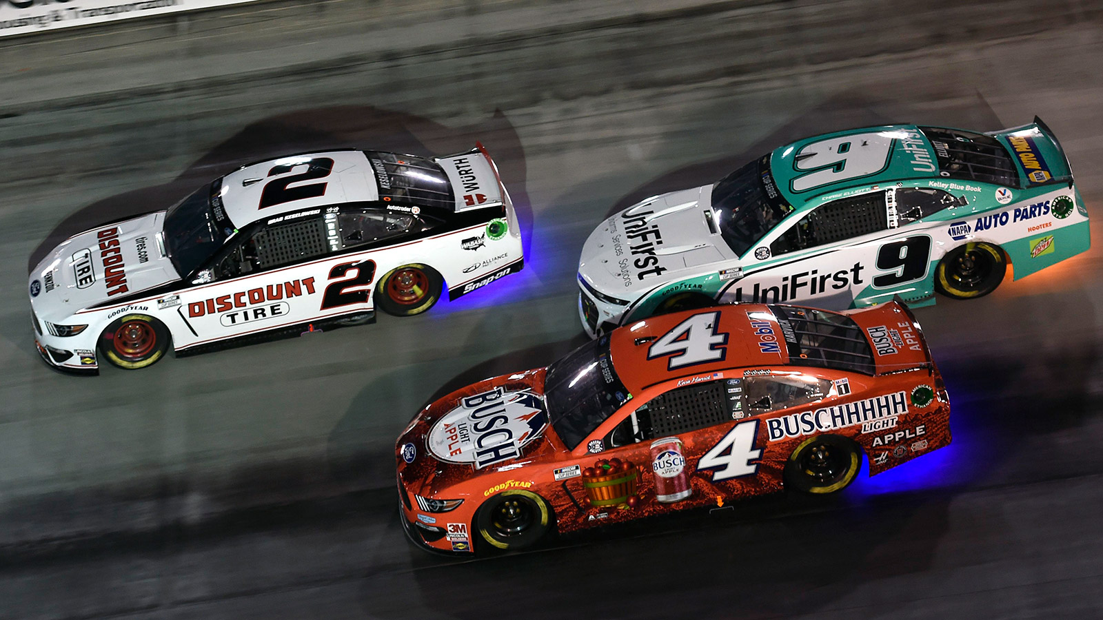
This is not the only recent development on the numbers front. You may recall that last summer, NASCAR experimented with different number placement on cars in its All-Star Race, moving the numbers backwards closer to the rear wheels to devote more space to sponsors. The reaction to that was decidedly more inflamed, and teams haven't run that look since — though rumors have flown about since they may return to it, in tandem with the introduction of the series' Next-Gen Car.

Is there anything objectively worse about the rearward number placement? No, but it is sort of a middle finger to tradition and the identity of these cars in exchange for larger and sillier logos, so I can understand the outrage.
I can especially understand it when the extra space is misused. See that #4 Busch car up there? All that additional room and the best idea they could come up with was a red can and a mostly-red bucket of apples, both almost completely lost against a red background. Seems like wasted potential.
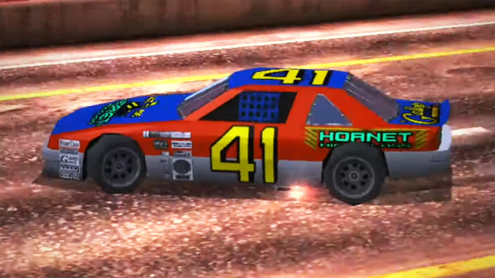
So, yeah — compared to that alternative, I'd much rather take the larger, centrally positioned numbers. In some cases, like on the #11 FedEx car, they kind of blend into the colors and overall design of the livery in a neat way you don't often see in NASCAR. I'm all for a team trying it out, just for kicks. And should they need any other excuses, allow me to remind NASCAR's powers that be that the greatest stock car in the history of motorsport had some pretty big digits on its side, too.

