These Automakers Need To Abandon Their Signature Design Elements, At Least According To Our Readers
One of the fun things about cars is that you can see them with your eyeballs even if you'd never dream of being able to afford one, much less buy one. Then again, that also means that you have to see all the ugly cars that look like mistakes, too. Whether you'll ever find someone in complete agreement with you on which cars are ugly mistakes and which ones aren't, no one can say. That doesn't mean you don't know you're right about everything, though.
When we learned that Bentley had abandoned tradition and given the updated Flying Spur single-unit headlights, the reaction wasn't nearly as negative as you might have expected. Sure, the Flying Spur had quad headlights before the refresh, but sometimes the people just appreciate a little change. Maybe new isn't always bad. So why stop at Bentley?
On Thursday, we asked you which automakers should abandon their signature design elements next. Not everyone stuck to specific design details that the automakers themselves would consider their signature design elements, but hey, sometimes you have to get a little creative when the obvious answers are already taken. Let's take a look at some of the most popular responses.
BMW
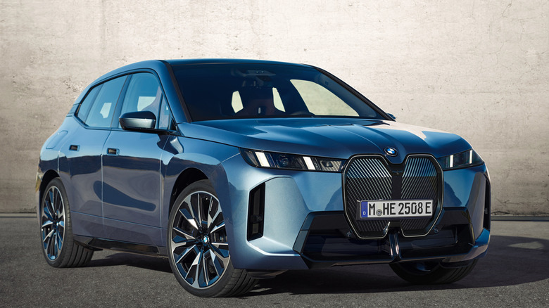
BMW's split grille. Yes, it was a staple for generations, but it looks hideous when applied to today's designs. It looks the car has buck teeth, which actually lead to internet memes.
Suggested by: Giantsgiants
Lexus
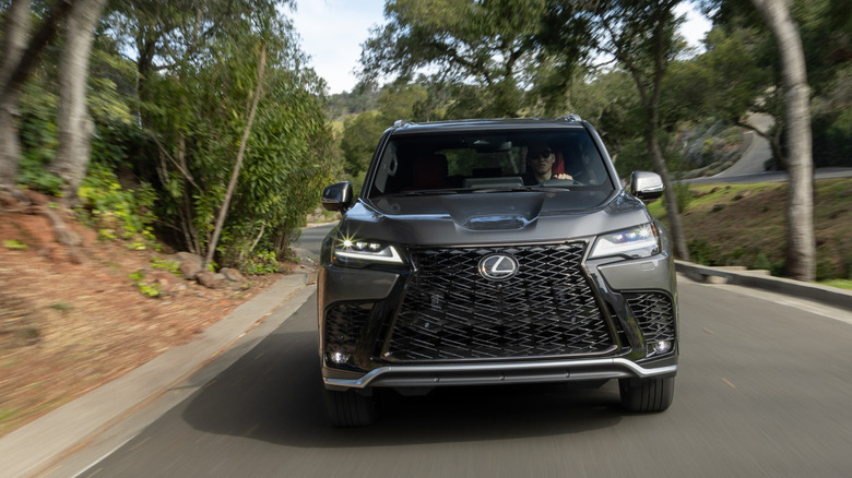
Lexus could stand to tone-down their predator grill styling. Keep the design, but pull back from running down all the way to the base of the front bumper. The current GX styling is a good example of the toned-down design working well.
Suggested by: Sector7GWagen
Buick
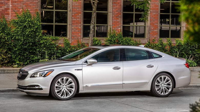
Buick finally, after many a year, go rid of those unsightly side "vent" portholes. They may have looked cool in the 50's but tacking them on modern models helped to maintain the "old man" car persona. Thankfully the new batch of SUV/Crossover renditions ditched the old styling baggage and went for a refreshingly modern look. Well done.
Suggested by: David Carl Freiboth
Porsche
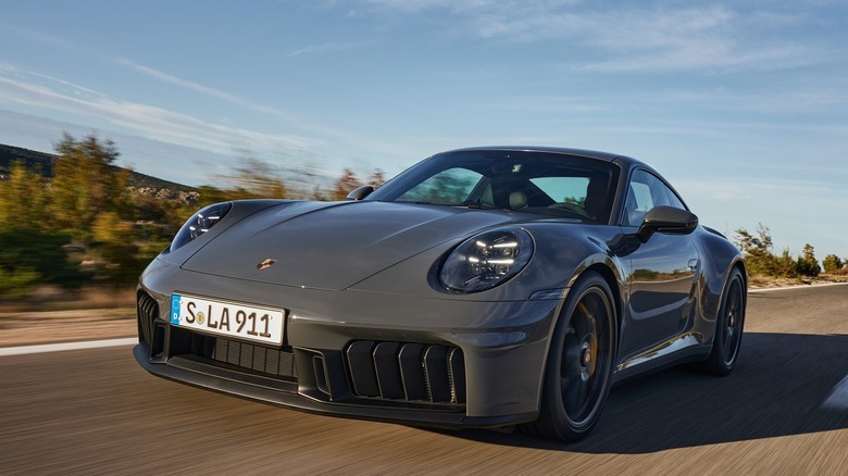
BMW was my first thought, but since that's taken several times over, I'll go Porsche.
It'll anger the internet for a really long time, but I'd love to see Porsche make a sports car that looks new. Everything has been an iteration on the 911 for ages. Let's go back to the 924s and 944s of the past for inspiration.
Suggested by: dolsh
Every full-size pickup
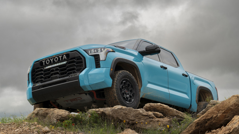
The huge grill on pick-ups! All of them.
Suggested by: Luc Desaulniers (minardi)
Tesla

Tesla should abandon its signature design element, which is Elon
without it, I'm sure the design will significantly improve
Suggested by: Derry
Ford
If Ford could abandon there signature recalls that might be good
Suggested by: Patrick Neff
Hyundai
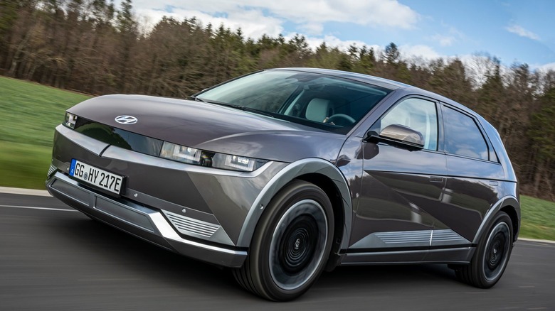
Hyundai needs a refreshed logo BAD. With their current edgy and arguably avant-garde styling, that "so '90s it hurts" oval badge with the swoopy "handshake" H is incredibly out of place wherever they incorporate it.
...and I don't mean replace it with the four-squares/"morse code H" that they've been putting on their steering wheels. They need something far more distinctive than that, but not so achingly "of its era" as the current oval logo.
Kia got a bit of crap over their "KИ" logo, but, visually, it absolutely WORKS with their new/current styling trend.
Suggested by: DiRF
Mercedes-Benz

I think Mercedes should stop with the dents in all of their 20 year old cars running around Atlanta. I know it's their signature, but I think it's a tired look.
Suggested by: Clay Horste
Subaru
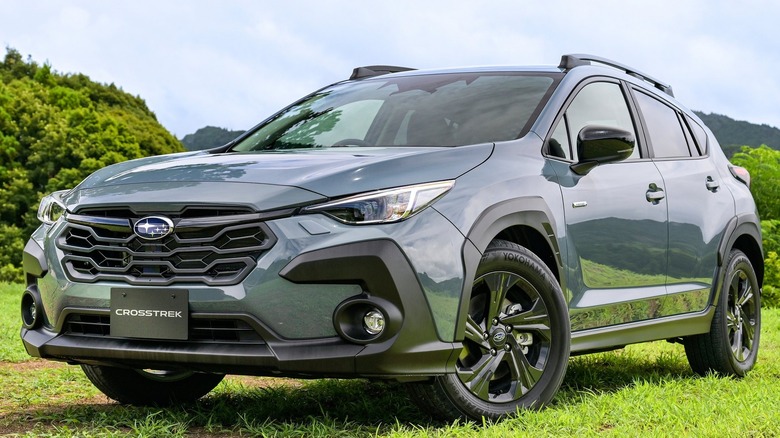
Subaru's plastic wheel arches. Please just let this trend die.
Suggested by: STIKleinWagon